Instacart Heuristic
Evaluation
Enhancing Instacart’s Shopping Experience
PROJECT
BrainStation Bootcamp
TIMELINE
Jun 20 - Sep 7
TEAM
3 UX Designers
TOOLS
Figma, Illustrator
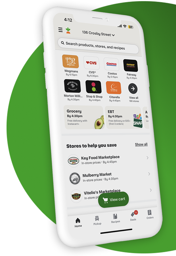
Enhancing Instacart’s Shopping Experience
BrainStation Bootcamp
Jun 20 - Sep 7
3 UX Designers
Figma, Illustrator

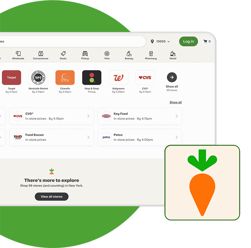
Project Overview
Instacart boasts a 4.9-star rating and a mission to simplify online grocery shopping. Our team embarked on enhancing the check-out process, addressing common user frustrations and heuristic violations.
We divided the heuristic evaluation into distinct roles: Usability Expert, UX Researcher, and Designer. Each member assessed specific aspects to identify issues and recommend improvements.
Before starting the evaluation, our team conducted thorough research, including an analysis of existing user testimonials. We wanted a comprehensive understanding of Instacart's platform and its specific target user base.
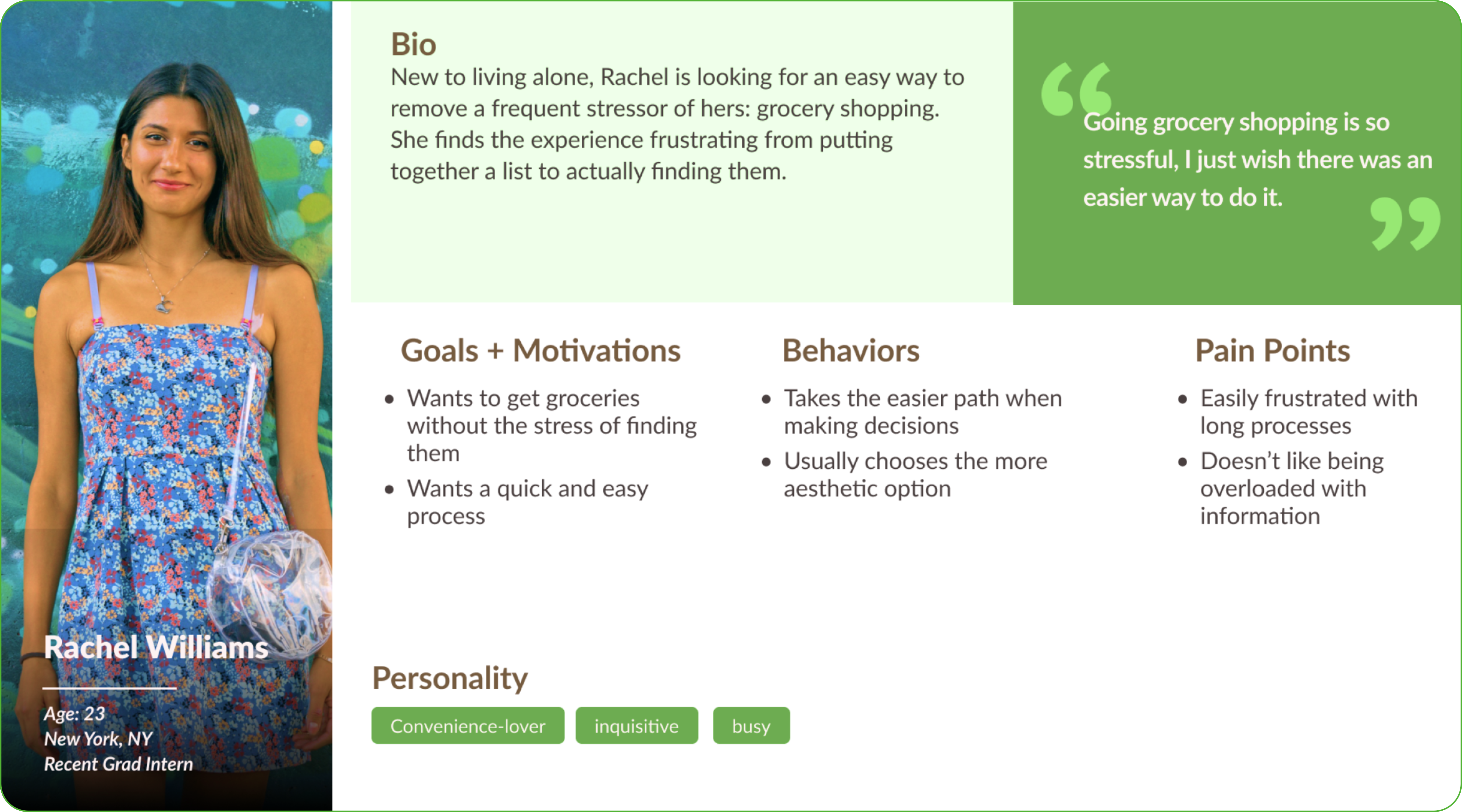
To understand our audience better, we created a proto-persona: Meet Rachel, a 23-year-old who wants a quick and stress-free grocery shopping experience. 61% of Instacart’s users are female, between ages 23 - 44 years old.
Prior to our evaluation, we researched Instacart's mission and goals to better understand the product and its value. We chose to study the process of ordering two items from Wegman’s.

Instacart's Mission
Make online grocery shopping easy and connect users with personal shoppers

Instacart's Goals
We each conducted heuristic evaluations, took notes, regrouped, and discussed our findings. We identified five violations out of the ten rules.
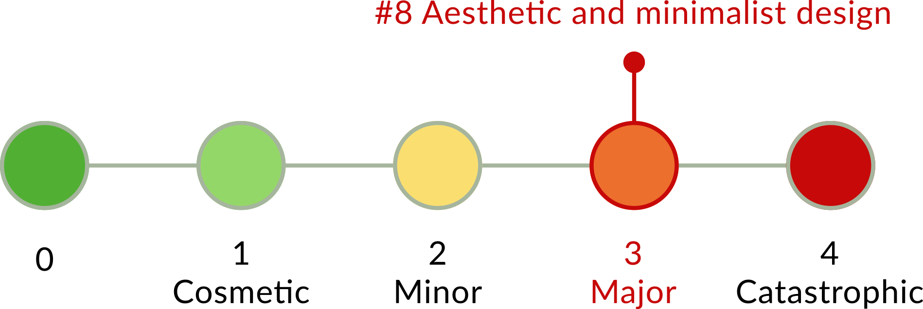
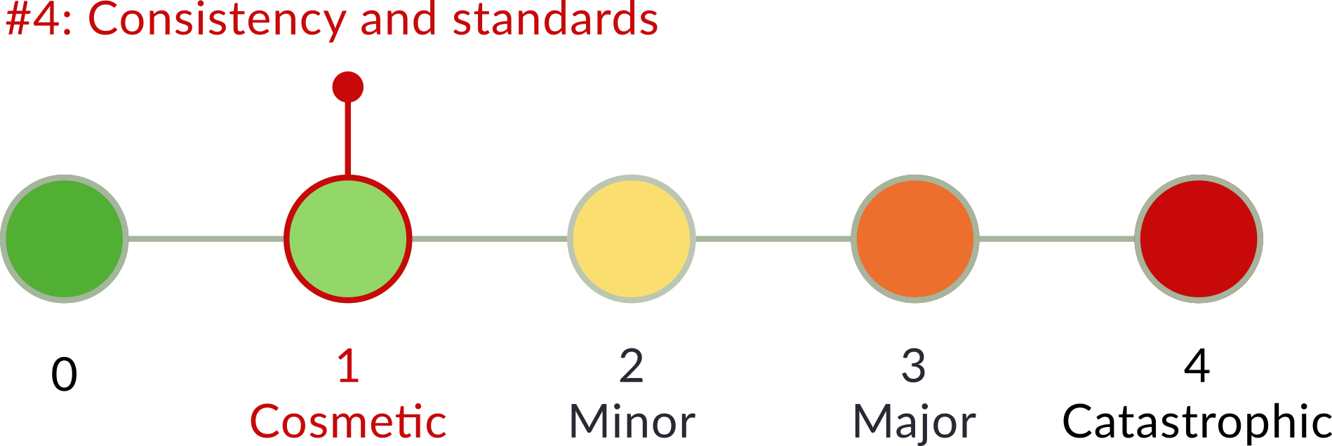
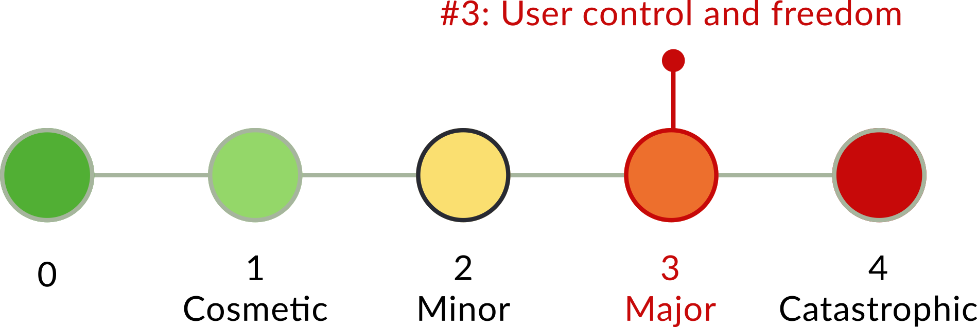
Next, we discussed, rated and assessed issue severity on a 0-4 scale.

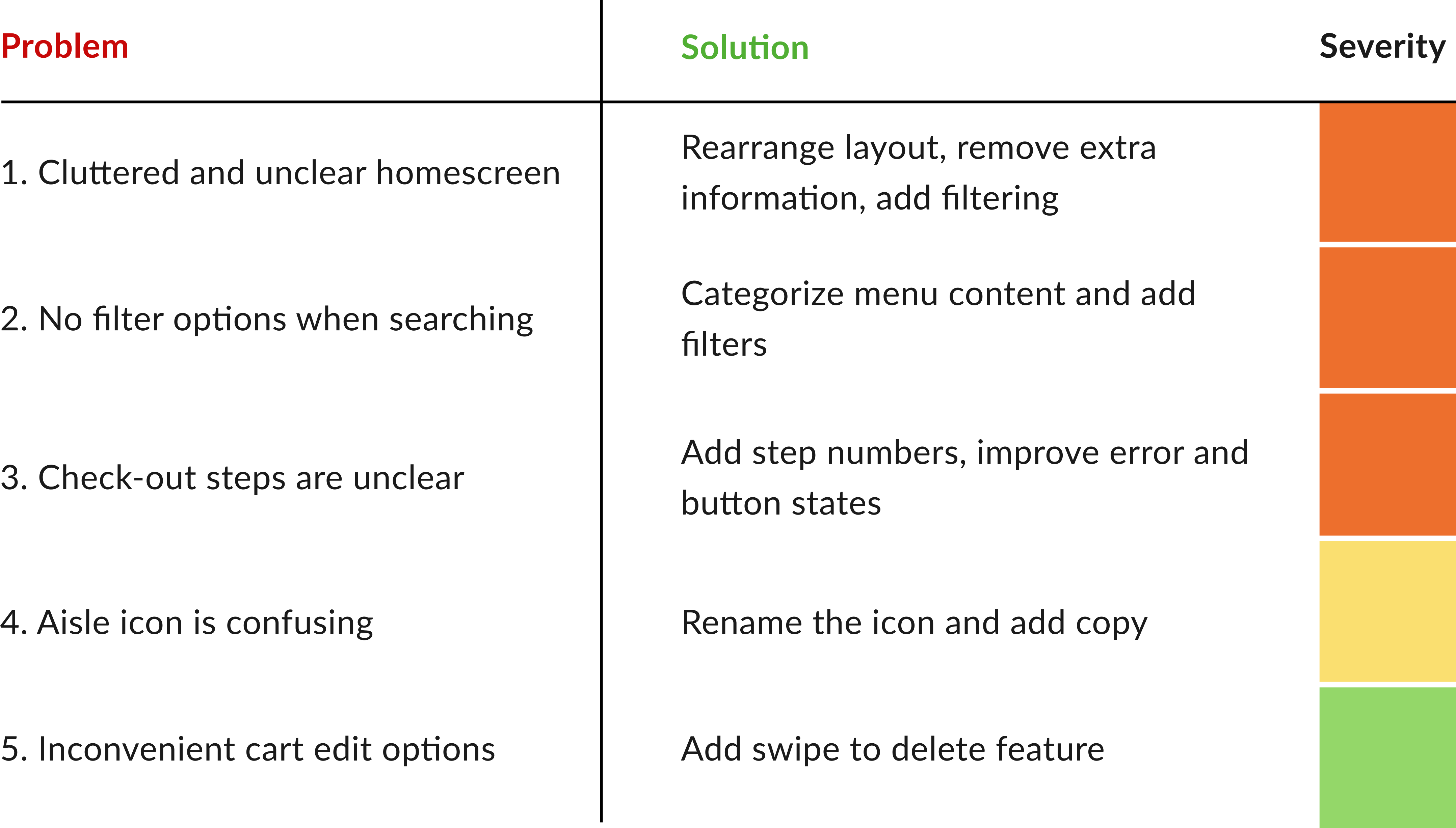
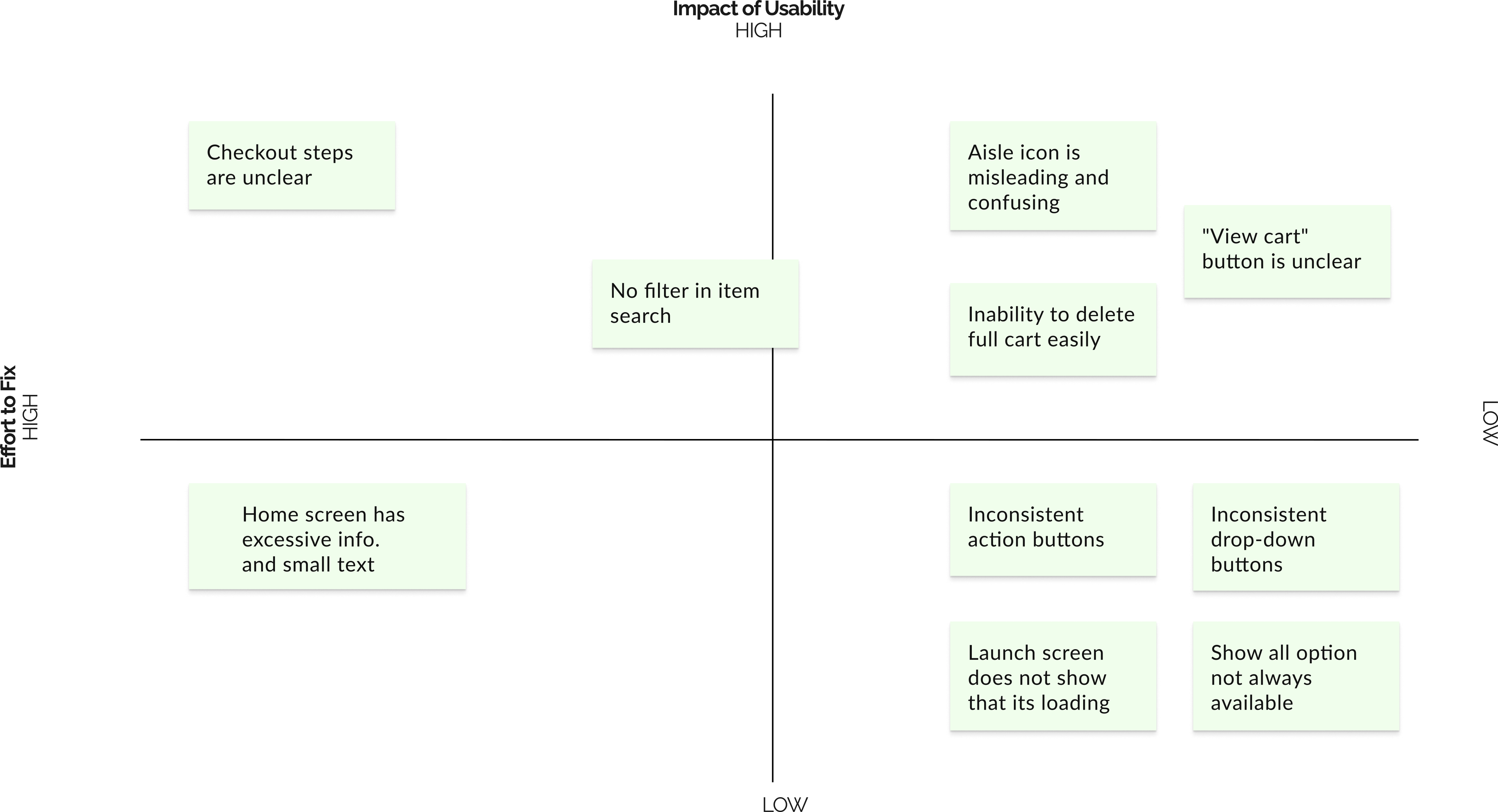
We designed a prioritization matrix to systematically address and allocate resources to the most impactful issues. It’s best to always start with the lowest hanging fruit!
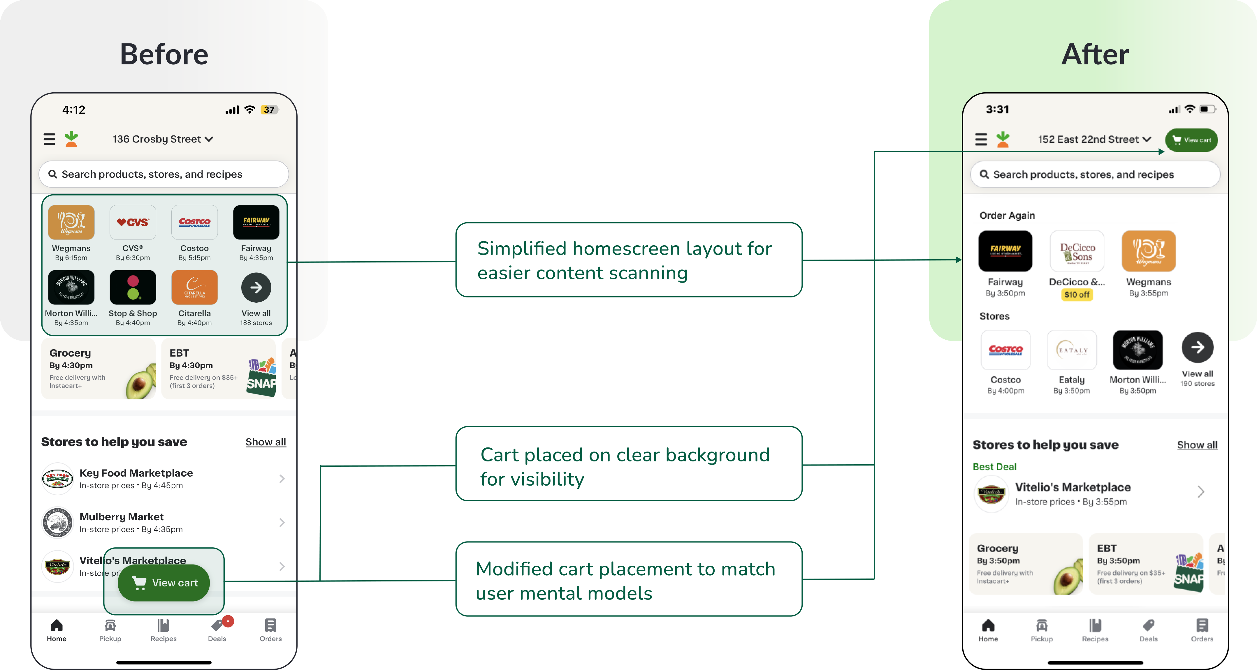
Next, we divided tasks, collaborated on solutions, and started prototyping. Check out the before-and-after screens that showcase the design improvements!
Violation 1: Homescreen
Recommendation:
A layout redesign to address home screen overcrowding and improve the visibility of the 'view cart' button.
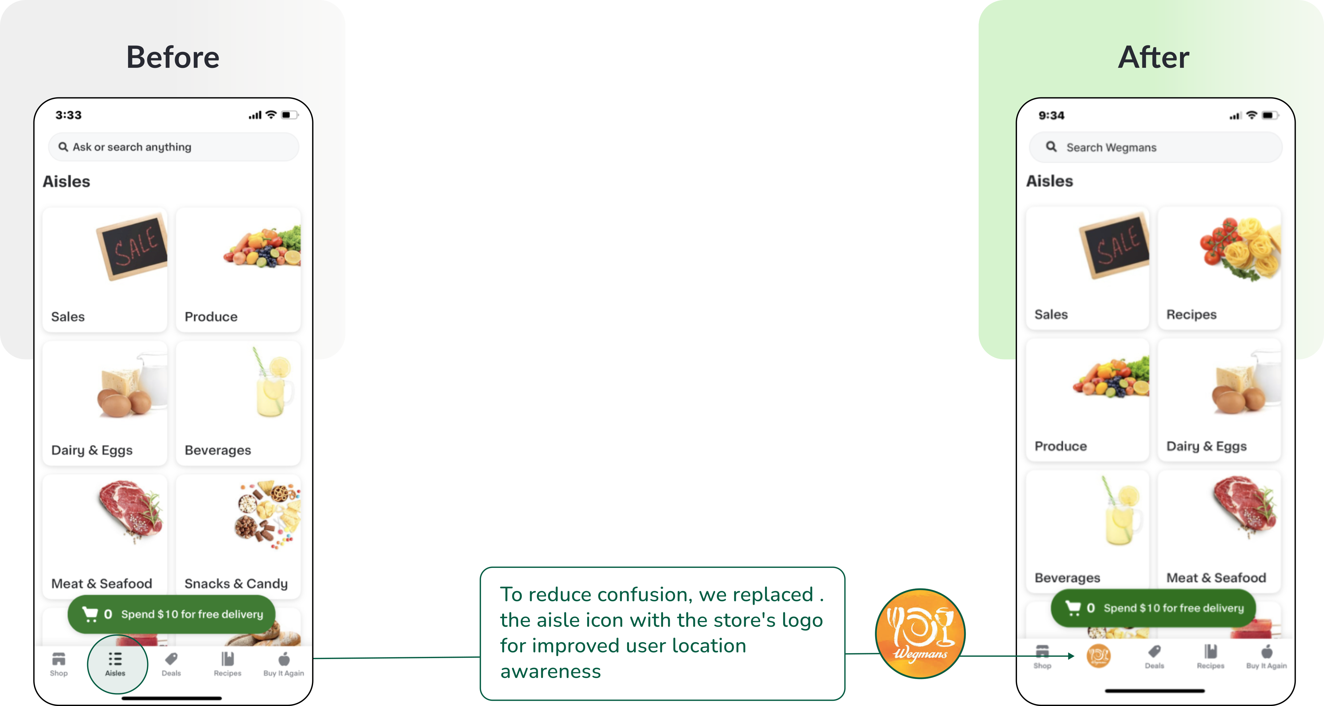
Violation 2: Aisle Screen
Recommendation:
Rename the aisle section or add copy to clarify its purpose to the user.

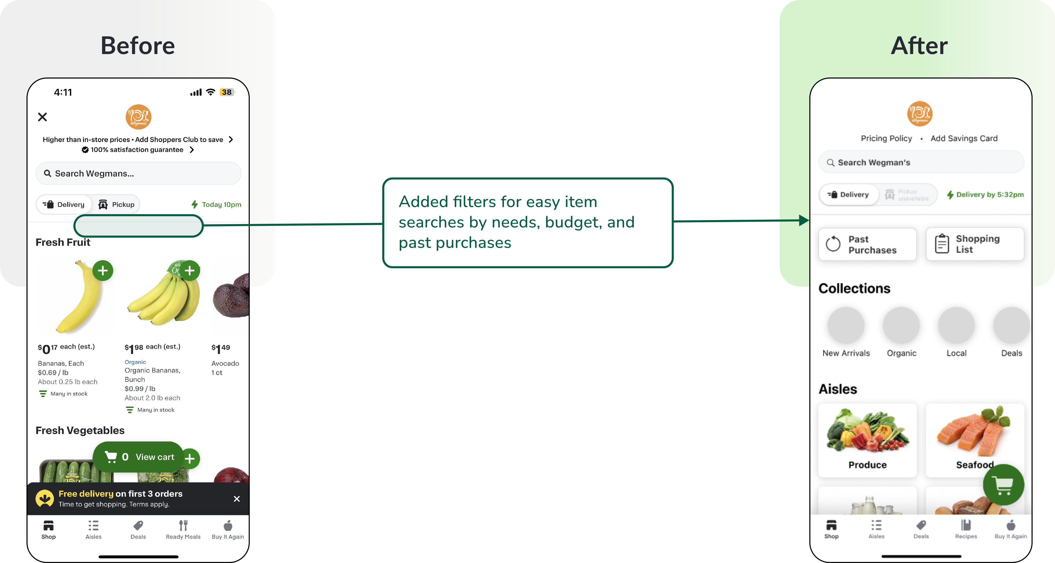
Violation 3: Store Screen
Recommendation:
Add a filter and divide the content into a menu of categories

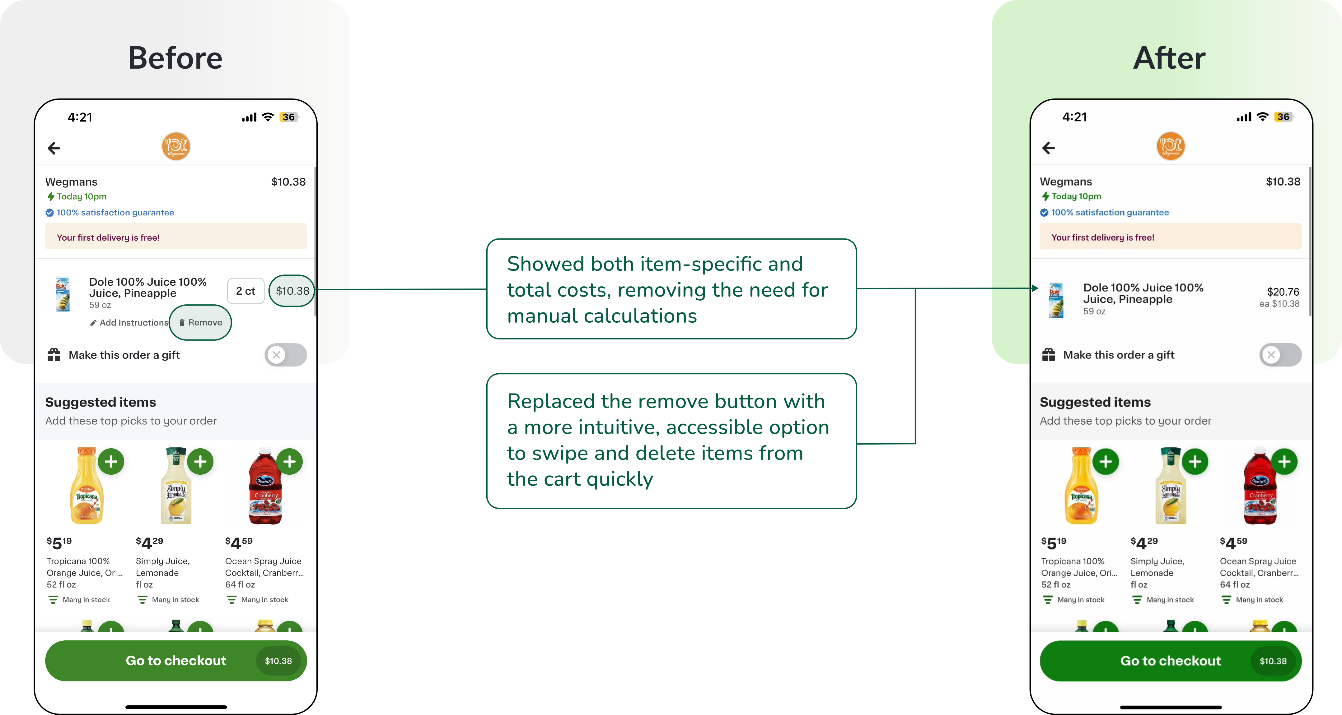
Violation 4: Cart Screen
Recommendation:
Incorporate a swipe-to-delete feature and fine-tune text styles for improved readability, aligning with user mental models.
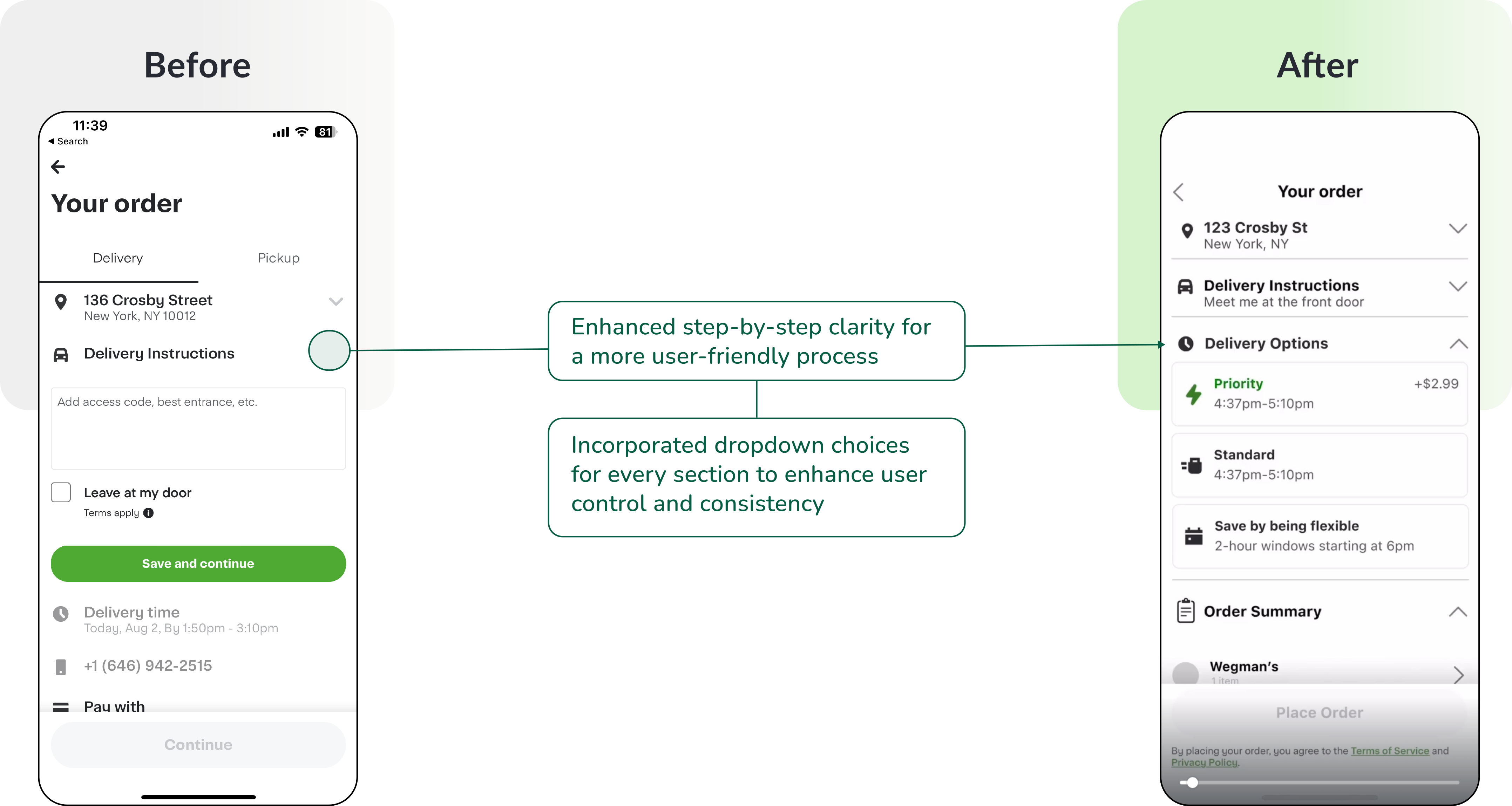
Violation 5: Checkout Screen
Recommendation:
Rename the aisle section or add copy to clarify its purpose to the user.
Heuristic Evaluation Importance
Numerous issues may go unnoticed, underscoring the importance of user testing to pinpoint potential hurdles or delays in the task flow.
Not all information is necessary for the user to have
Unnecessary information can clutter and confuse, leading to cognitive overload for the user. Mastering UX writing is crucial for clear, concise communication.
Conduct Usability Tests
Conduct usability testing with target users to validate the proposed changes. This step ensures that the improvements align with user needs and expectations.
Iterations Based on Feedback
Based on the usability test results, refine the design and make any necessary adjustments. Iterate on the design until it meets the desired user experience goals.
Development
Collaborate with developers to implement the approved design changes. Ensure that the development team understands the changes and can execute them effectively.