Step 7: Ideate | Step 8: Define
To define FlySmart's visual identity, I analyzed user preferences in travel apps, considered airport stressors, and focused on our persona Evelyn's priorities by categorizing adjectives into themes.
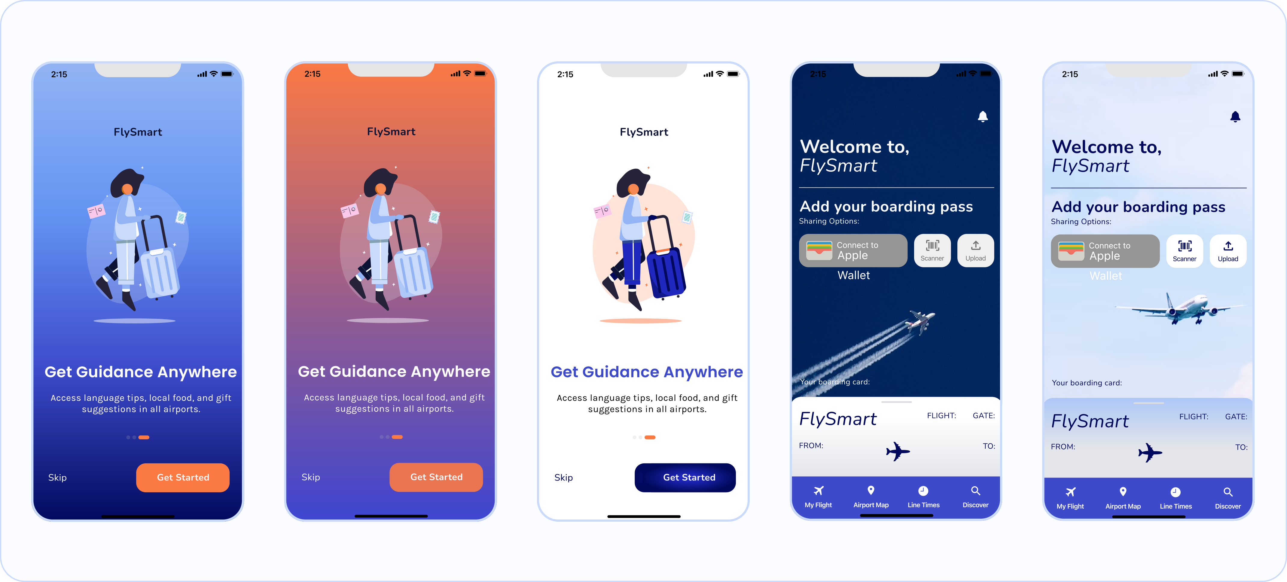
After 4 iterations, I created a mood board that embodies the brand's essence, featuring dominant blues for trust, warm oranges for friendliness, and smooth, sky-inspired gradients.
I created a core color palette from the mood board, making brightness and tone adjustments to address accessibility issues, notably with the blue and orange combination.
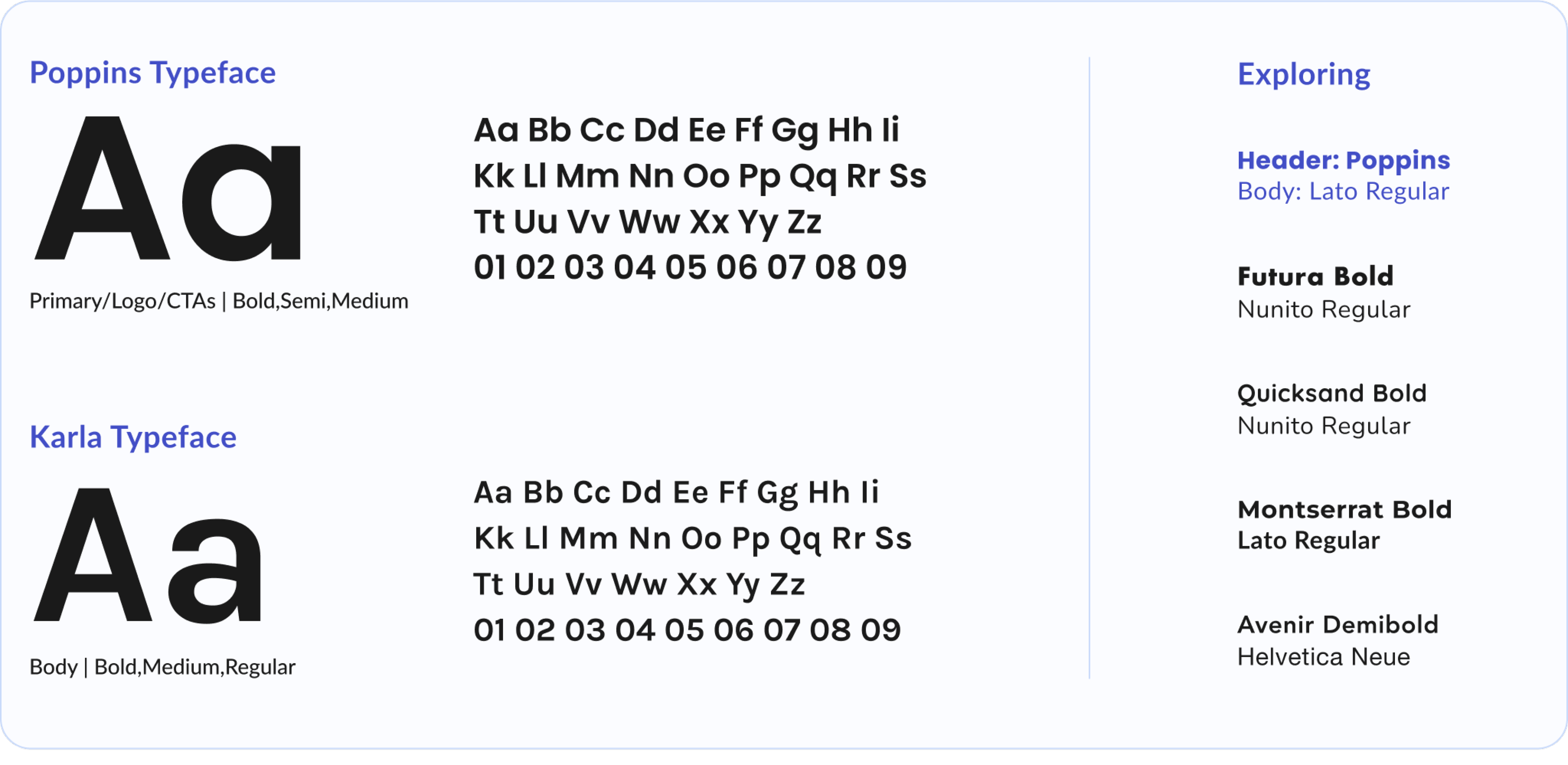
I explored font pairings and selected 'Poppins' and 'Karla,' two sans-serif typefaces. Their contrast strikes a balance between a modern, approachable ('Karla') and sophisticated, elegant ('Poppins') feel.
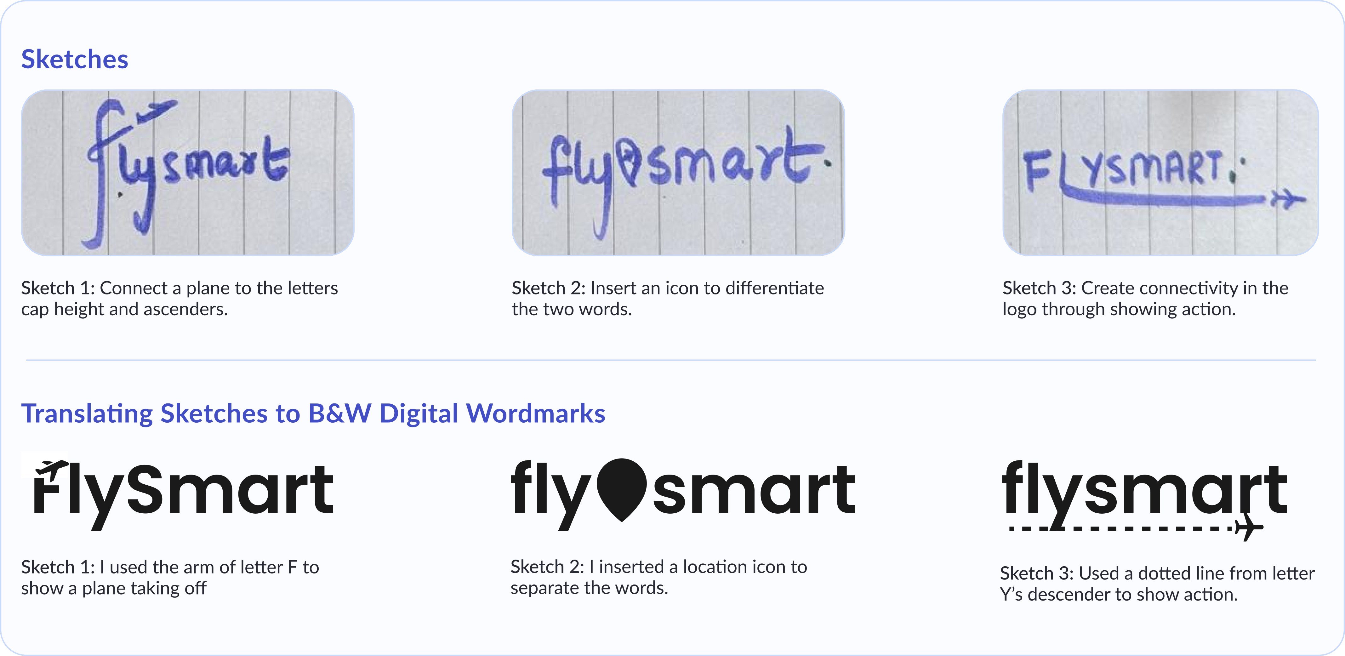
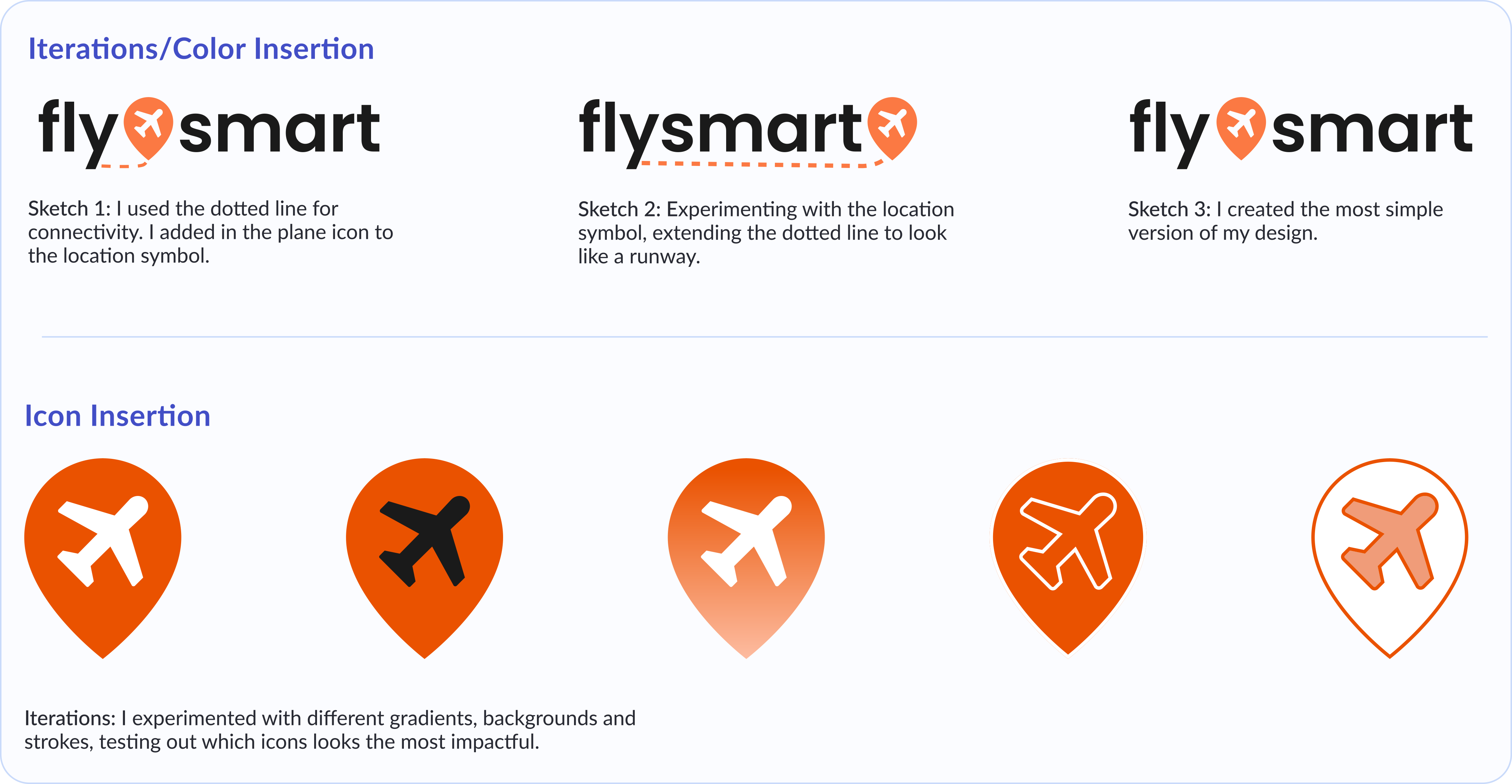
My goal was to design a simple, legible logo. I sketched out ideas, tested upper and lower case letters, and played with airplane/location symbol positions. I refined the design through 5 iterations based on feedback.
I inserted colors to test out how the visual identity would reflect in the logo. Opting for orange, I chose to reserve blue tones for backgrounds, the majority screen space.