Your gateway to
seamless travel
End-to-End Design Case Study
PROJECT
BrainStation Bootcamp
TIMELINE
Jun 20 - Sep 7
ROLE
UX Designer | iOS
TOOLS
Figma, Zeplin, Adobe
End-to-End Design Case Study
BrainStation Bootcamp
Jun 20 - Sep 7
UX Designer | iOS
Figma, Zeplin, Adobe

Project Overview
FlySmart App is your futuristic travel buddy, offering indoor airport navigation, real-time updates, and cultural insights, all while simplifying and personalizing your travel experience.
Responsible for UX research, wireframing, low-fi and high-fi prototyping, usability tests, branding, design system creation, accessibility, and design iteration.
My Process
I applied user-centric innovation in every phase of the five-phase design thinking process.

The Problem
In 2023, airport traveler stress rose 90% due to more chaos & security. What's more shocking, is that this coincides with a 761% increase in solo travel interest on Google Trends.
The Solution
An airport travel app with indoor mapping, real-time updates, and local dining, shopping, and additional recommendations.
Let’s take a quick dive!
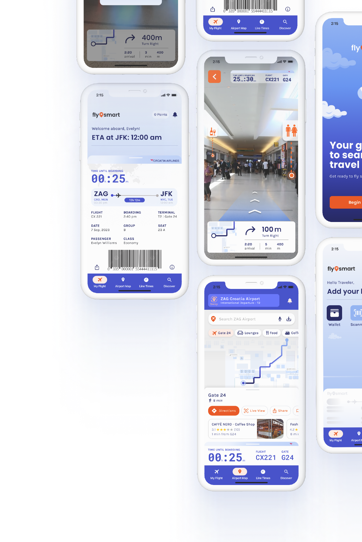
Onboarding Screens, explains the purpose of the app and how it works
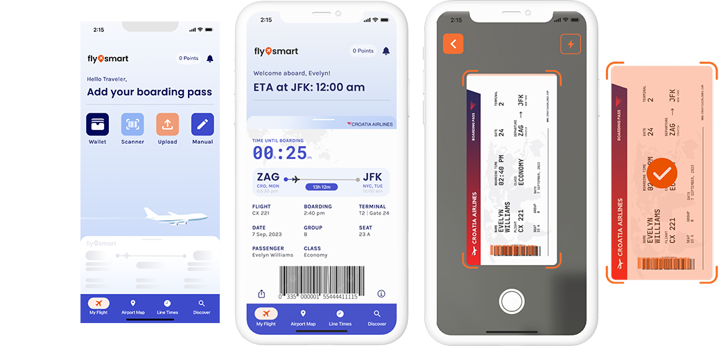
Empty/Full home screens & the scanner - 1 of the 4 tools for
boarding pass upload, depending on your journey stage
Indoor Mapping Screens, helps travelers navigate airports
globally with more control and ease
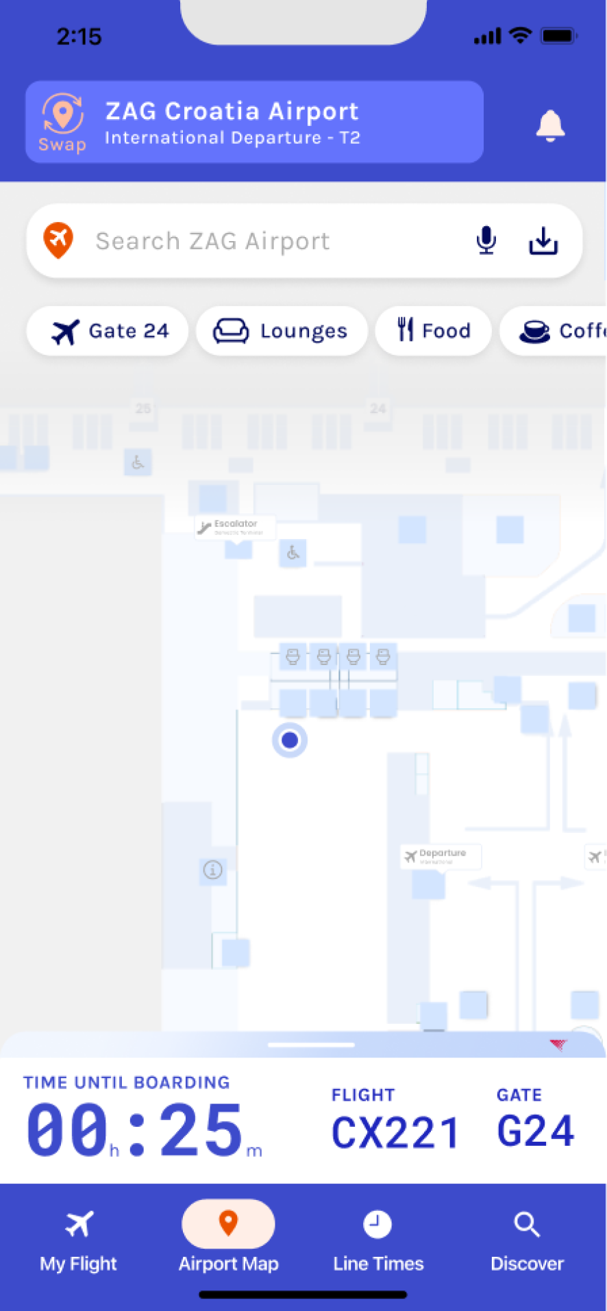
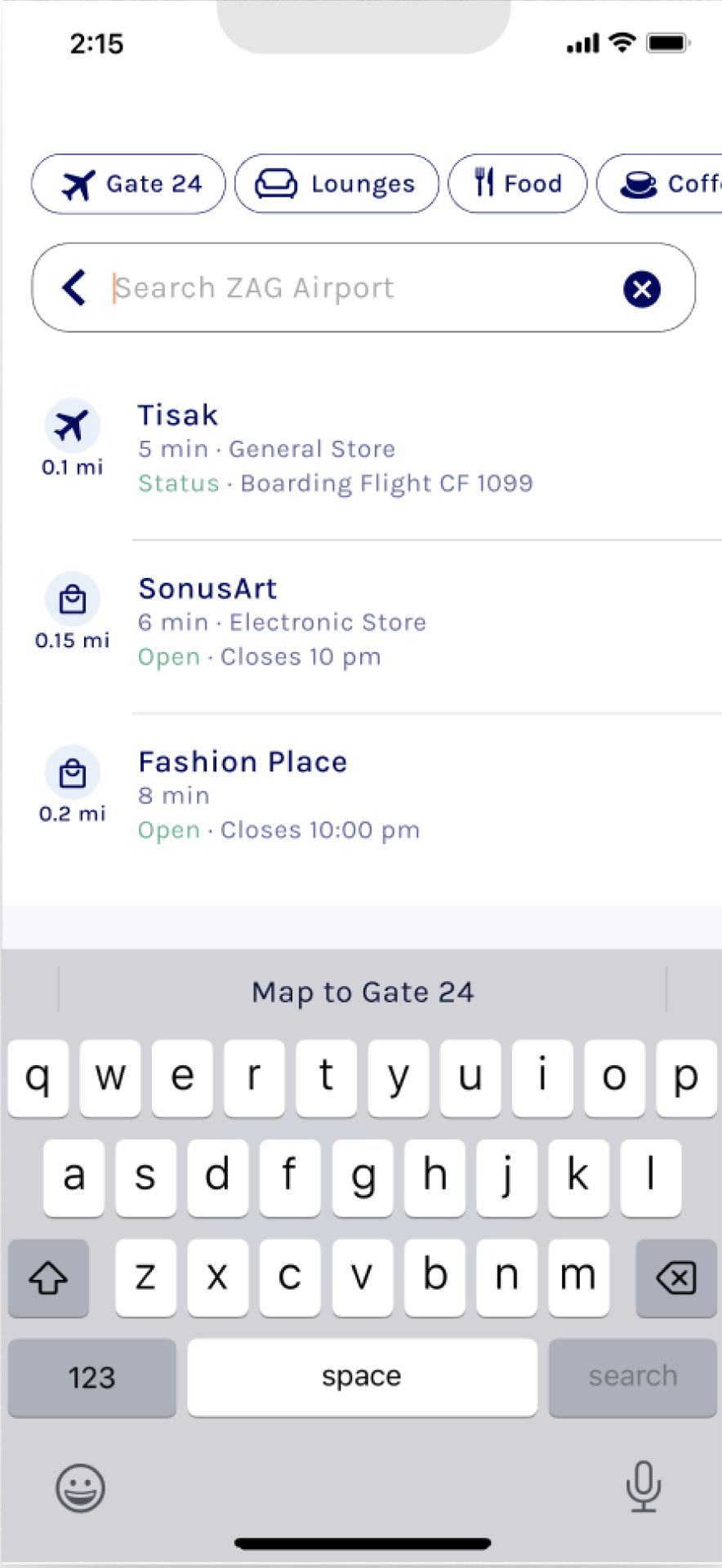
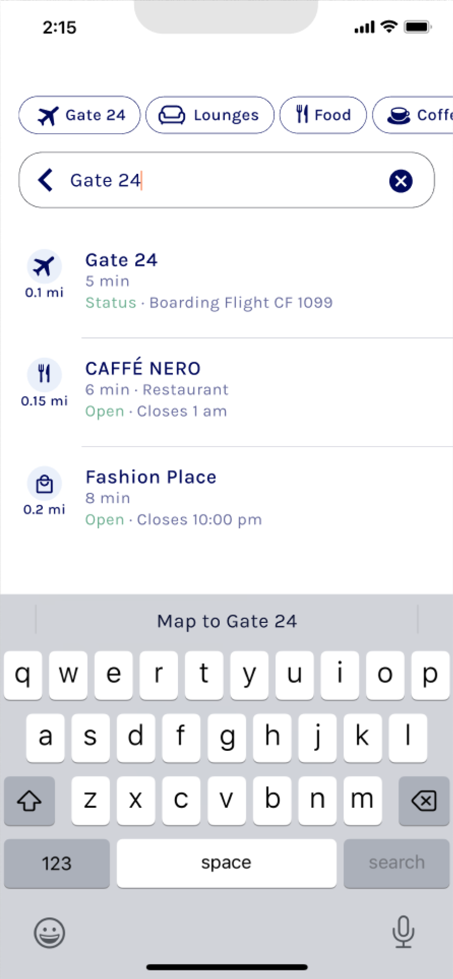
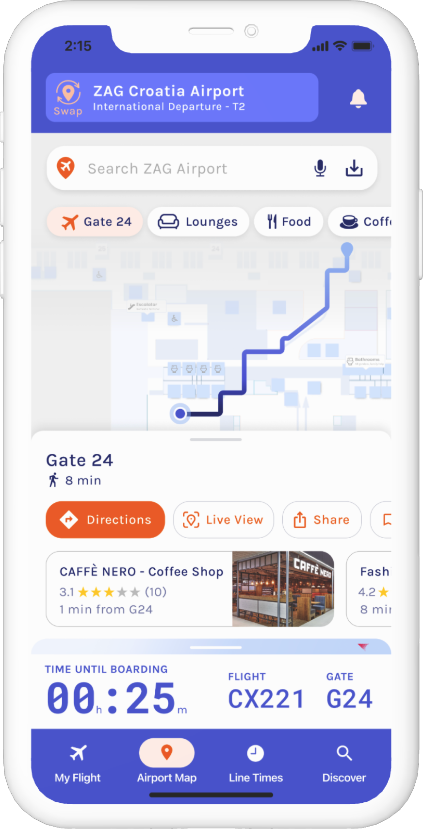
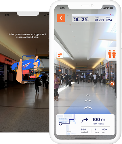
AR/VR Mapping Screens, equipping today's travelers with
tomorrow's technology.
Step 1: Empathize
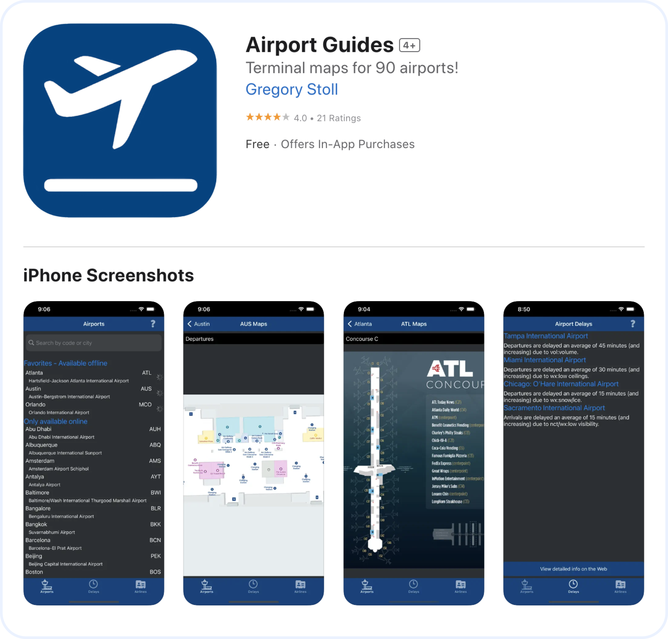
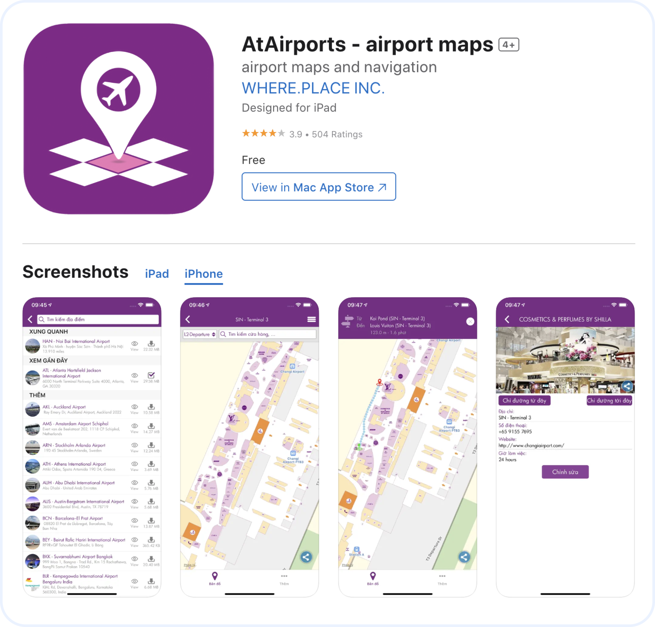
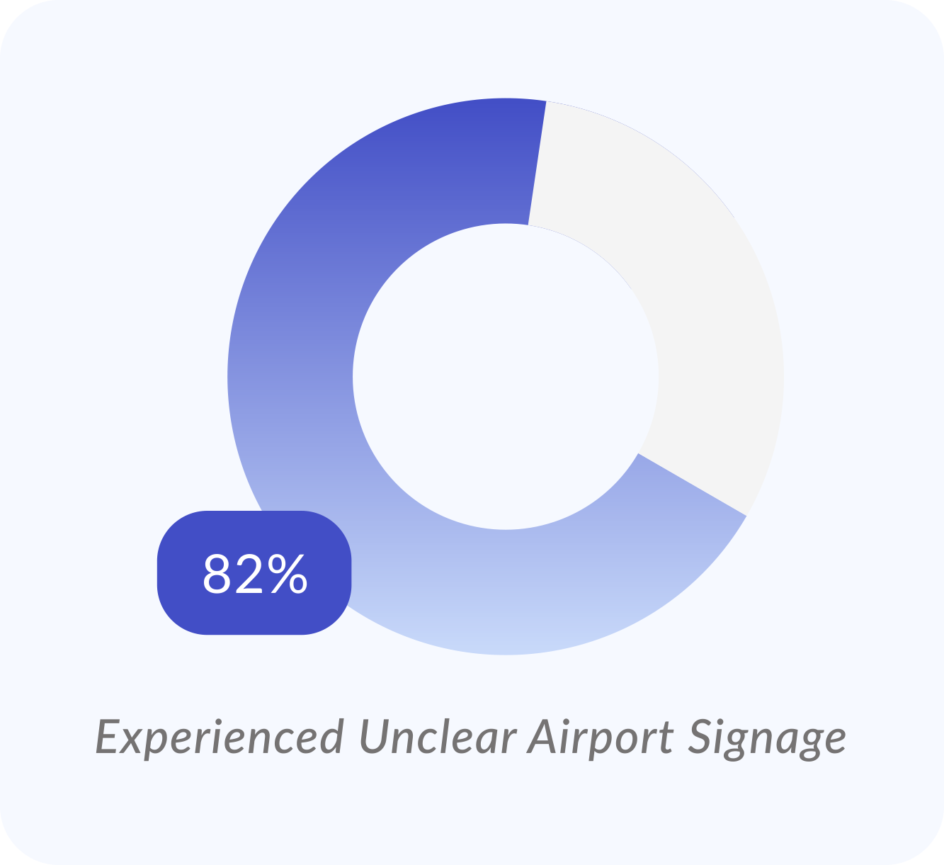
Research confirms poor airport design and confusing signage contribute to airport chaos. Existing solutions like AirportGuides and AtAirports have limitations and usability issues.


Interviews | 5 Participants
Participant 2, 24 years old, Marketer in New York
User Survey | 22 Responses
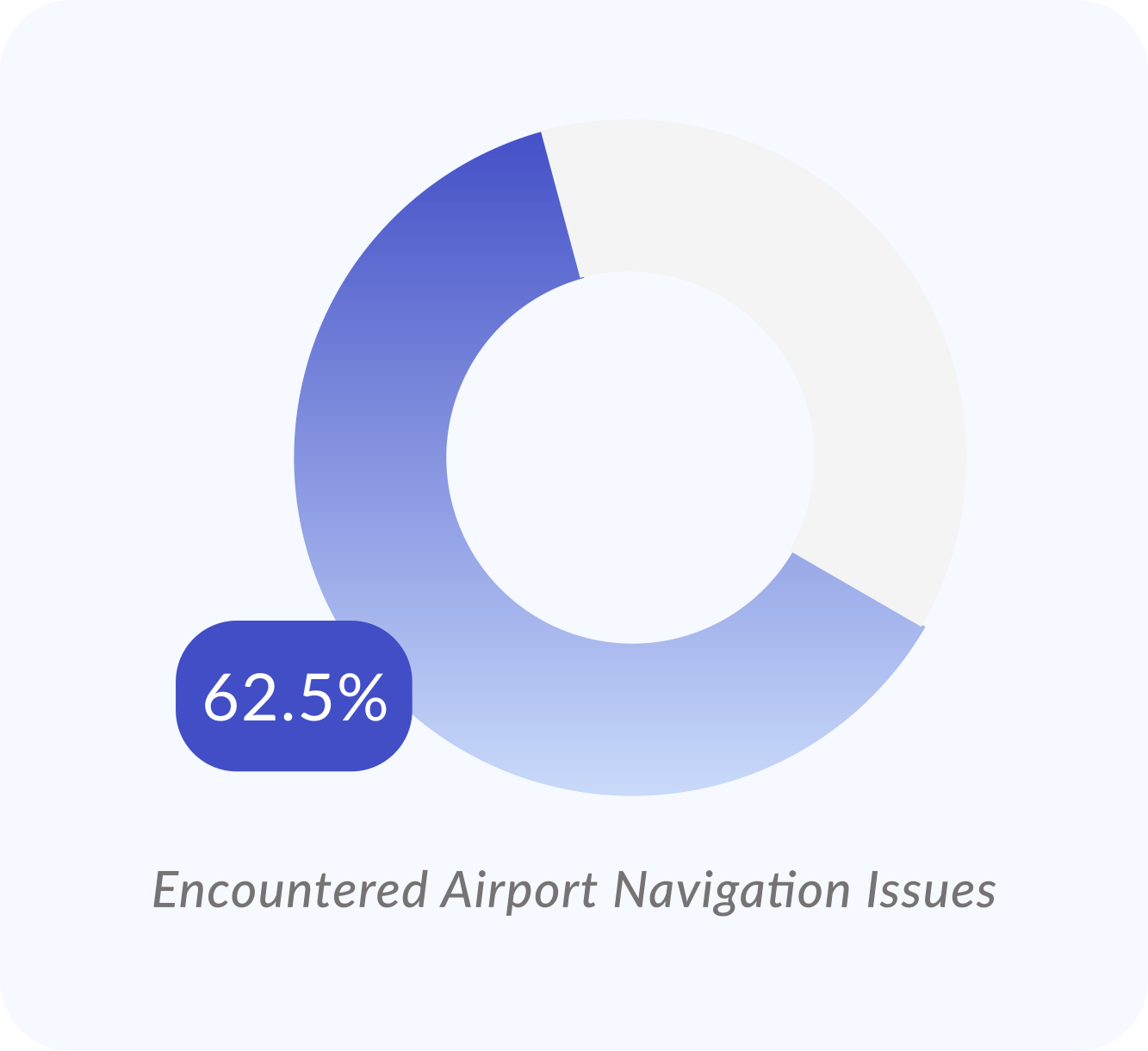
I identified my target audience through a broad survey, revealing that frequent travelers aged 18-35 actively seek tech solutions for a smoother experience.
Affinity Mapping | 4 Themes
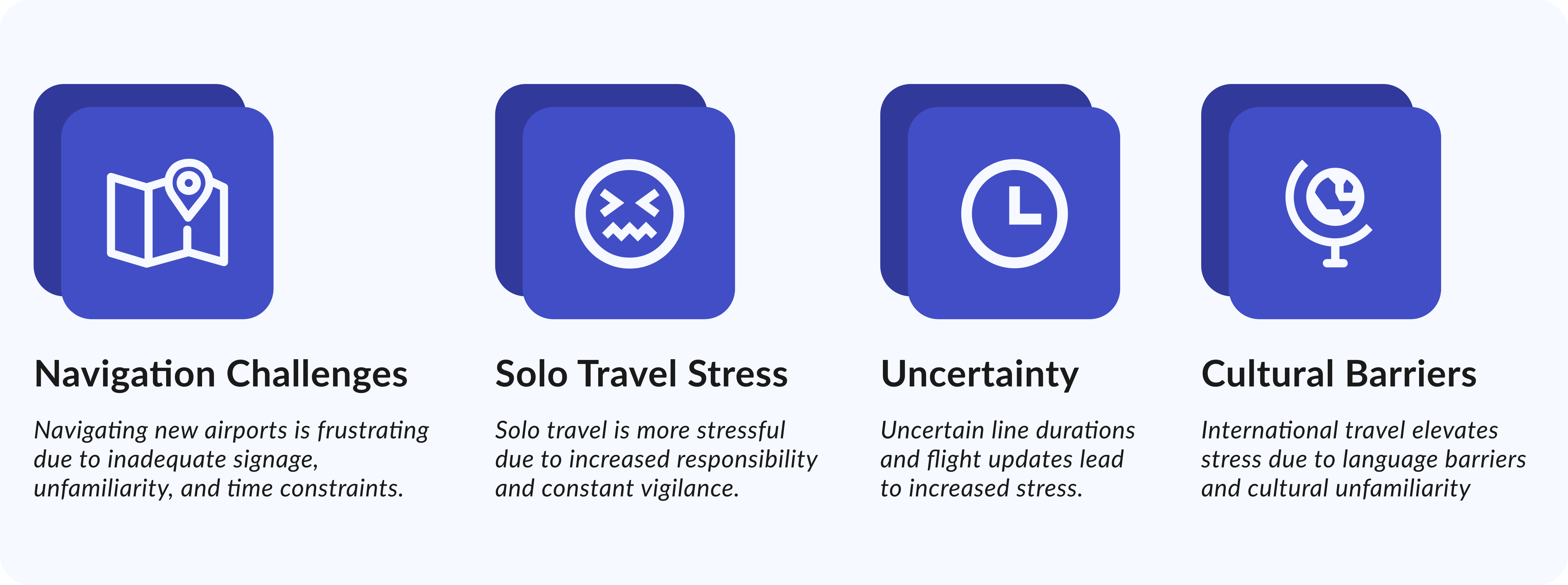
I organized and analyzed my data, extracting relevant insights and themes that revealed my target users’ #1 pain, navigation challenges.
Refined HMW
With the new insights, I fine-tuned my HMW to narrow in on the pain point I aim to address.
Step 2: Define
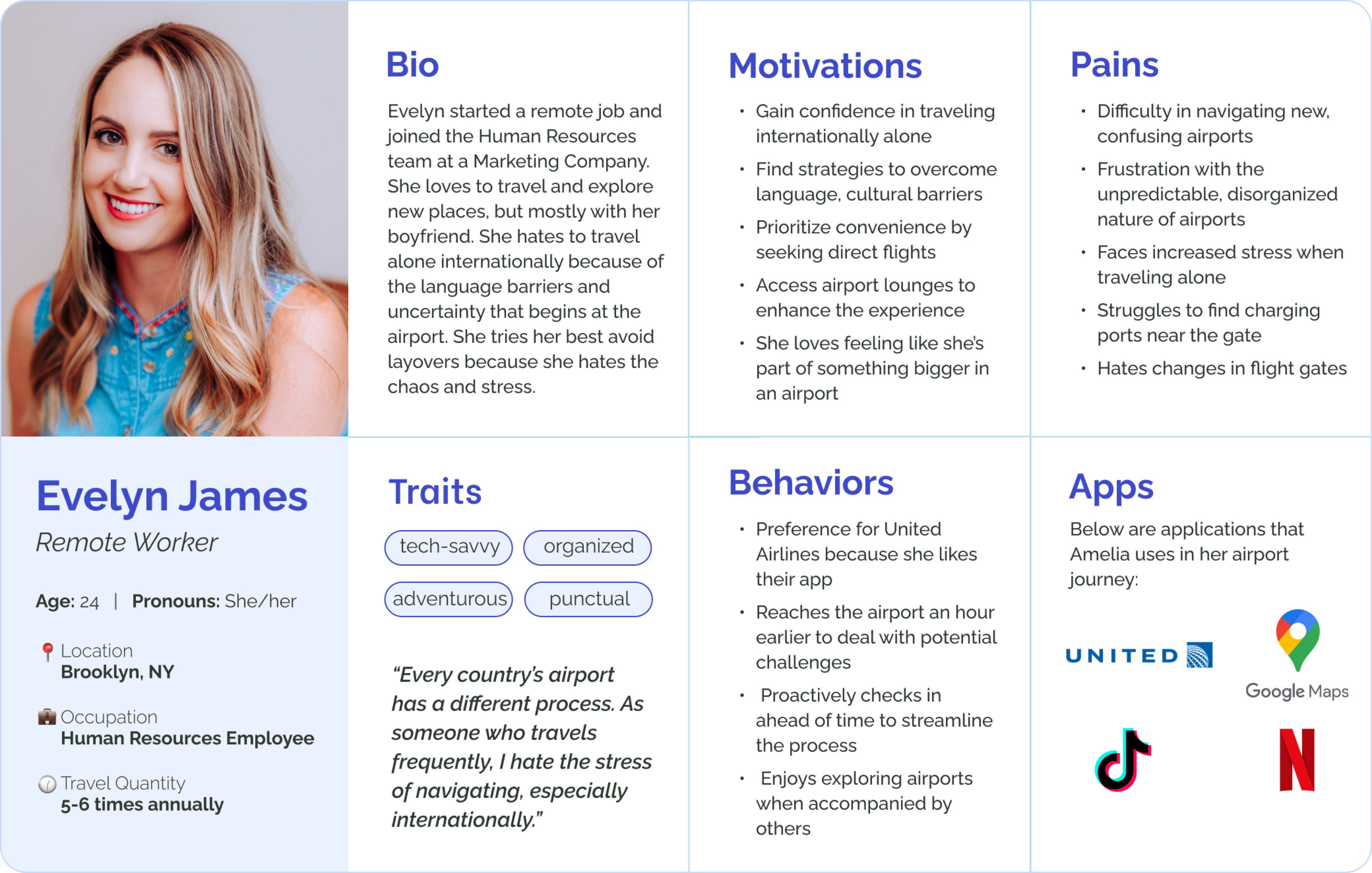
From my primary research, I developed FlySmart's persona: Evelyn James, a frequent flyer.
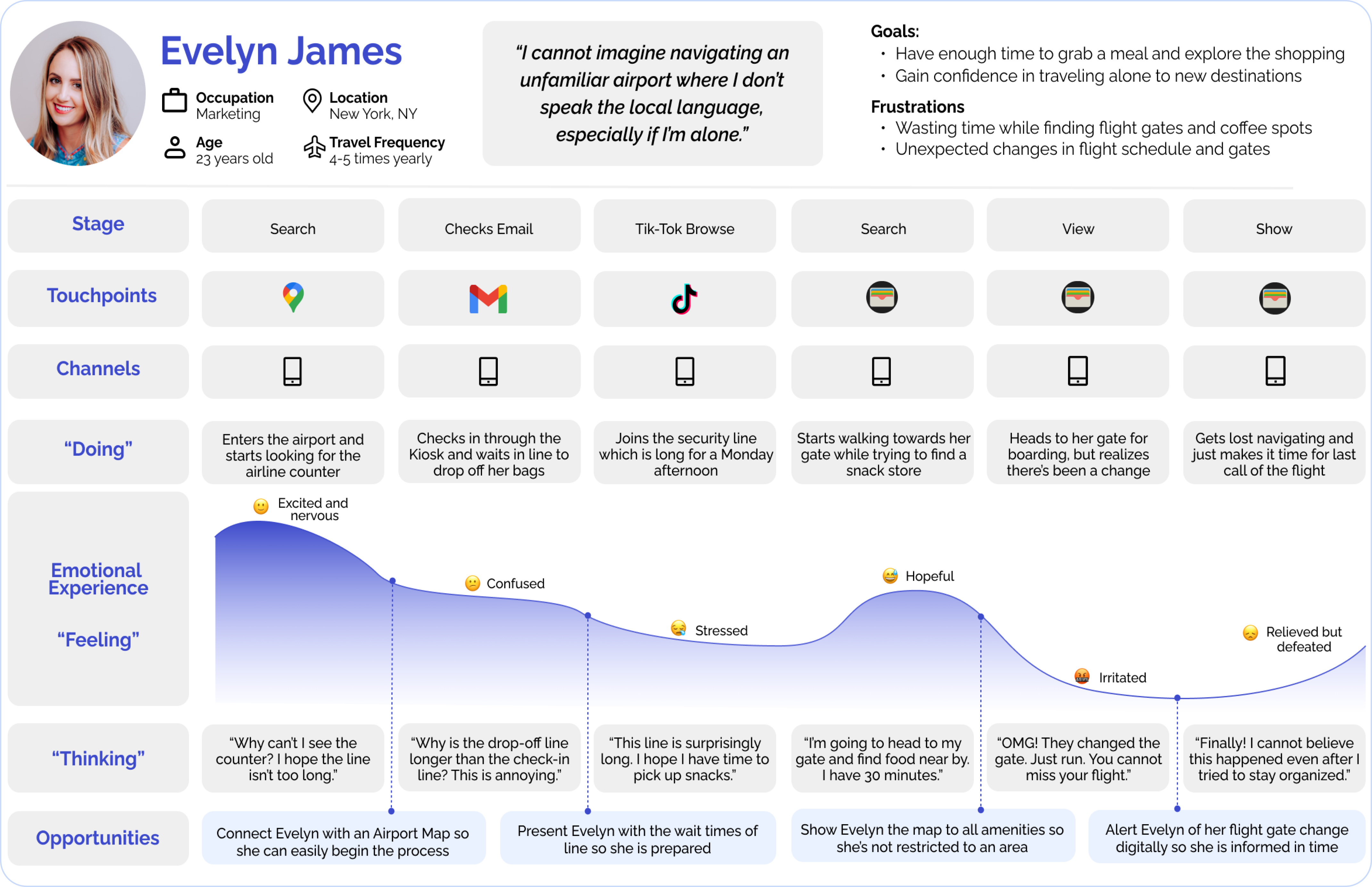
Given the complexity of travel, I made an important choice to focus only on airport entry to boarding. I built this map to understand Evelyn's journey and find design opportunities.
Step 3: Ideate
User Stories | 27
Using the persona/experience map, I created user stories, and built epics, extending 'Mapping' by 10 extra stories for a comprehensive user needs assessment.
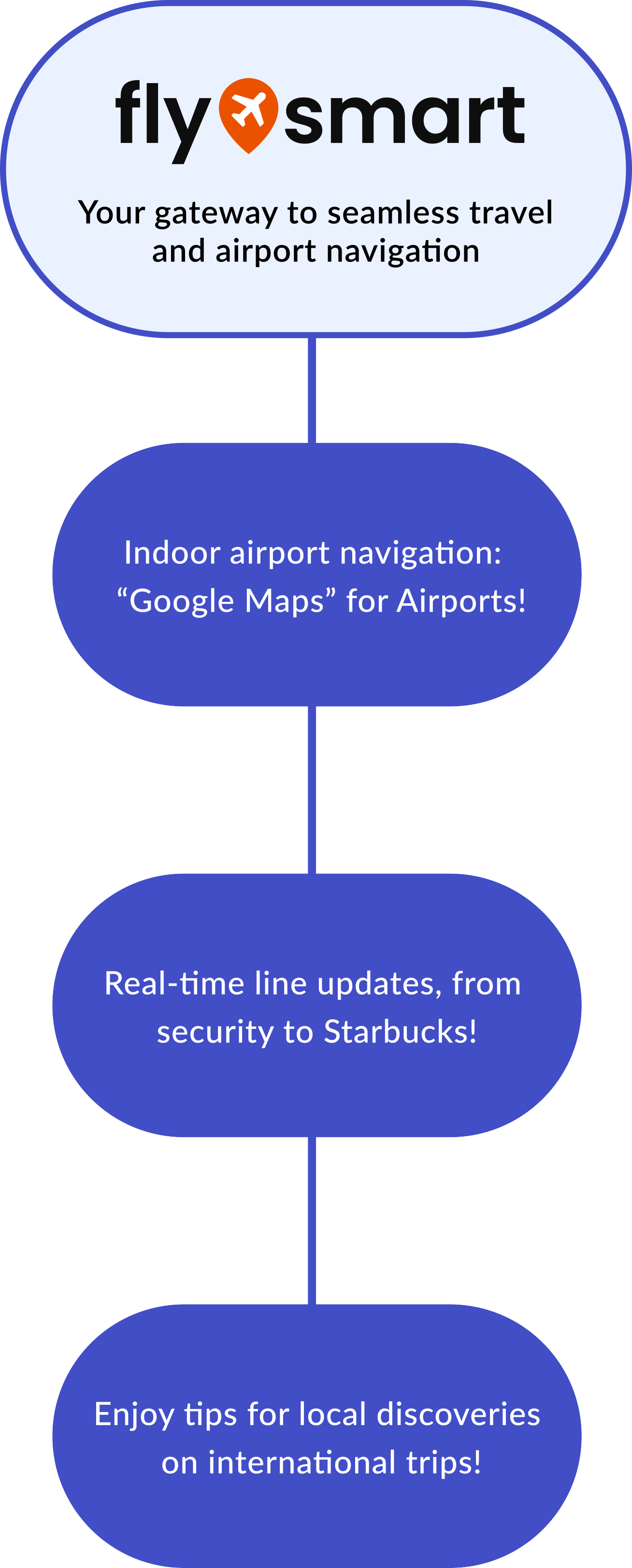
An all-in-one airport app for indoor navigation, real-time updates, recommendations, and language assistance.
#1 Easy Airport Mapping
💡Partnership with MongoDB
#2 Real-Time Updates
#3 Enhance Local Discoveries
💡Partnership with DuoLingo
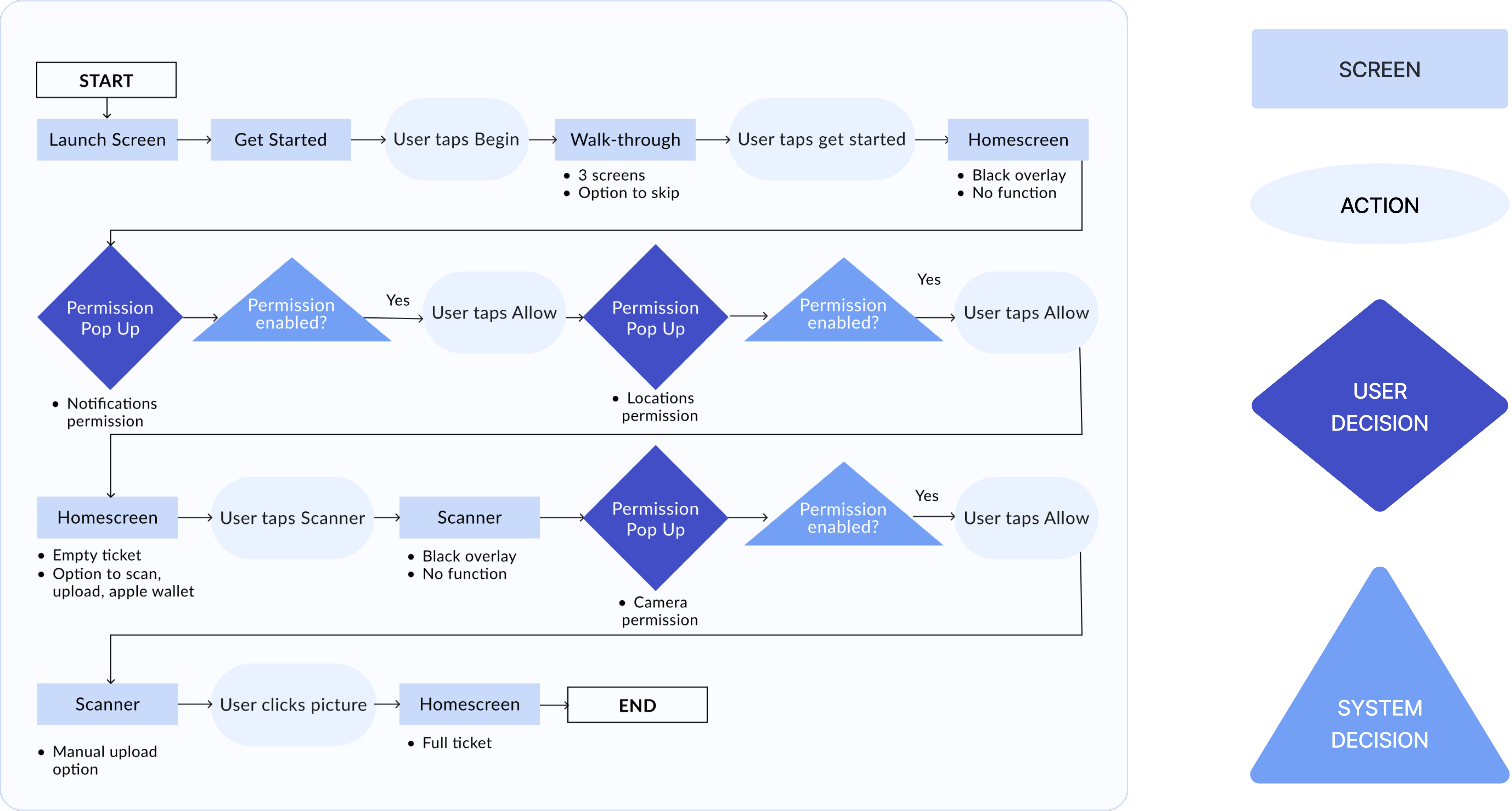
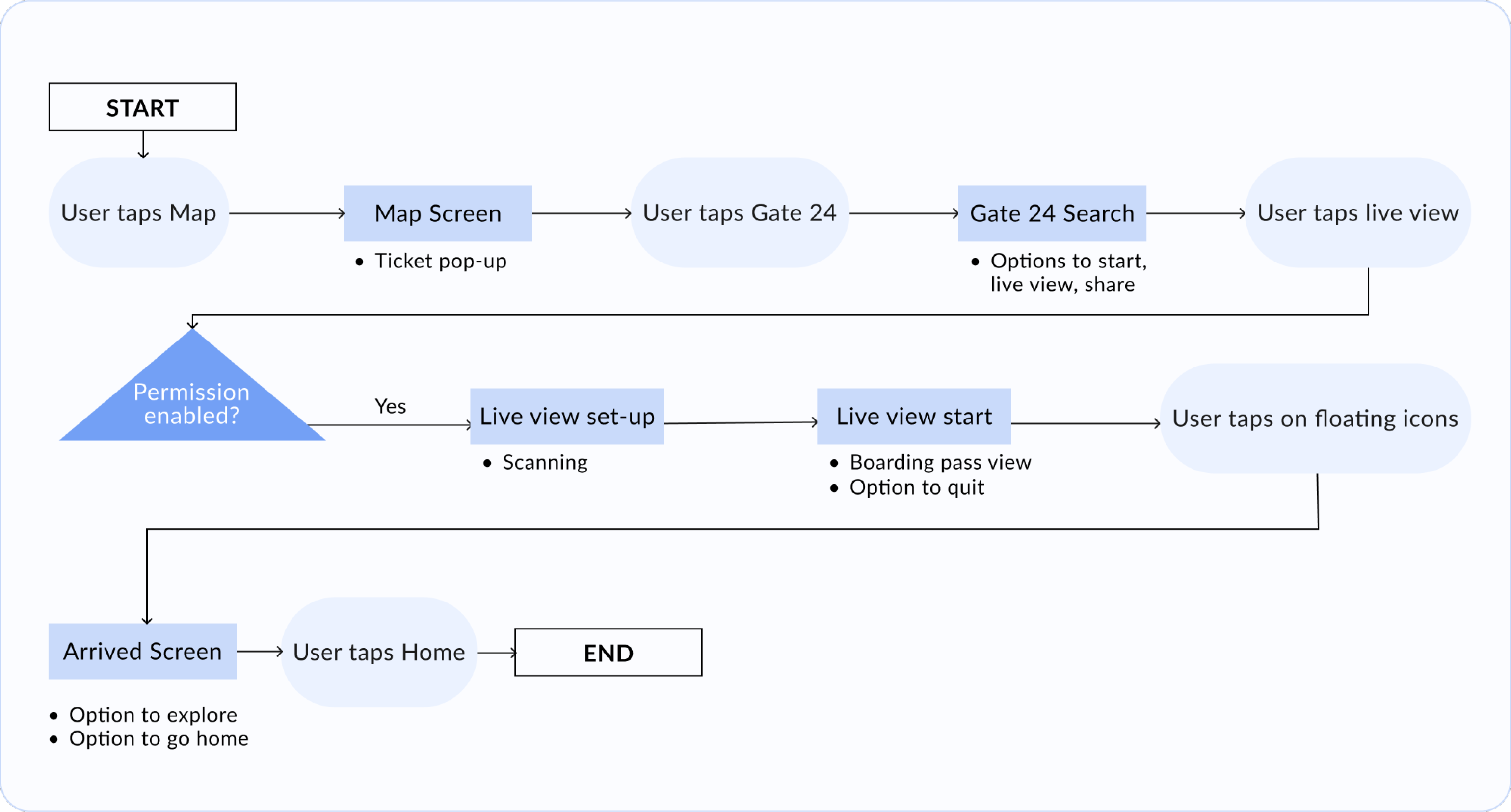
Inspired by the user stories, I started the ideation of my task flow, but was faced with the challenge of determining the sequence of events. After 4 iterations, I finalized on two flows:
Primary: Onboarding, permissions and boarding pass set-up
Secondary: Providing an option to map out their gate using AR features
Primary Task Flow
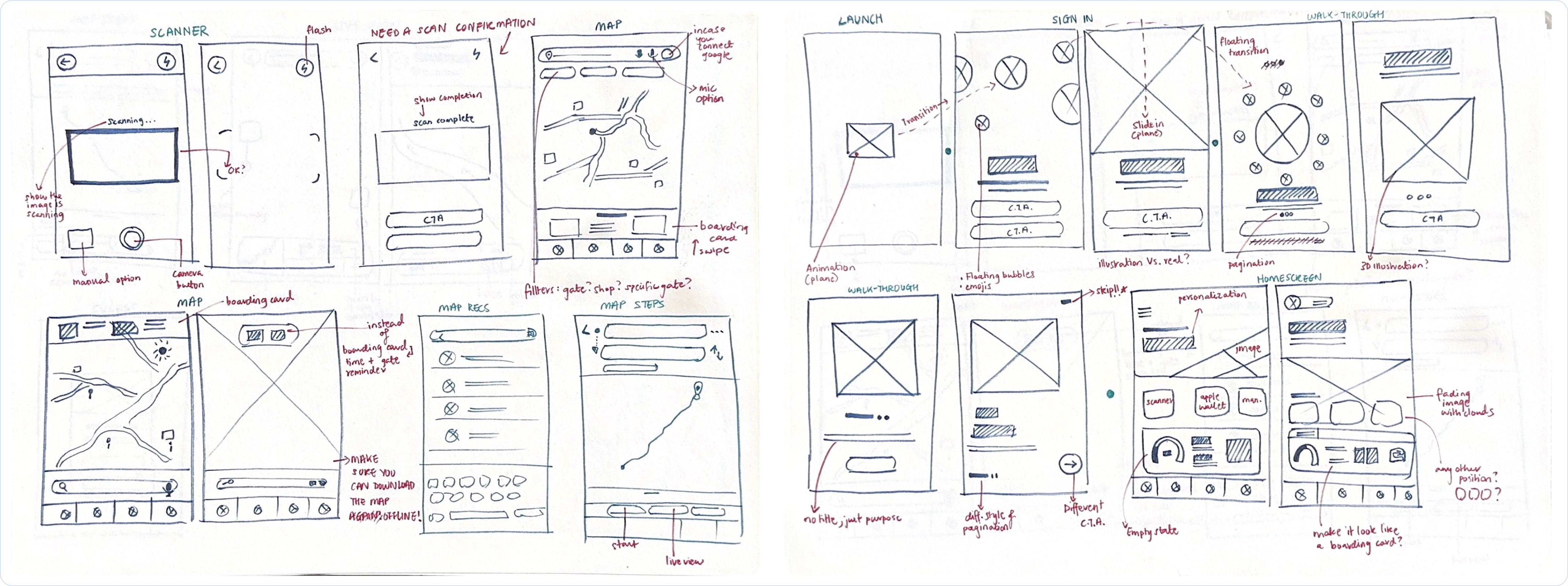
I began with 17 sketches (2-3 per screen) to quickly generate and iterate on ideas. I also began brainstorming interaction design ideas for a seamless app flow at this stage.

Step 4: Prototype
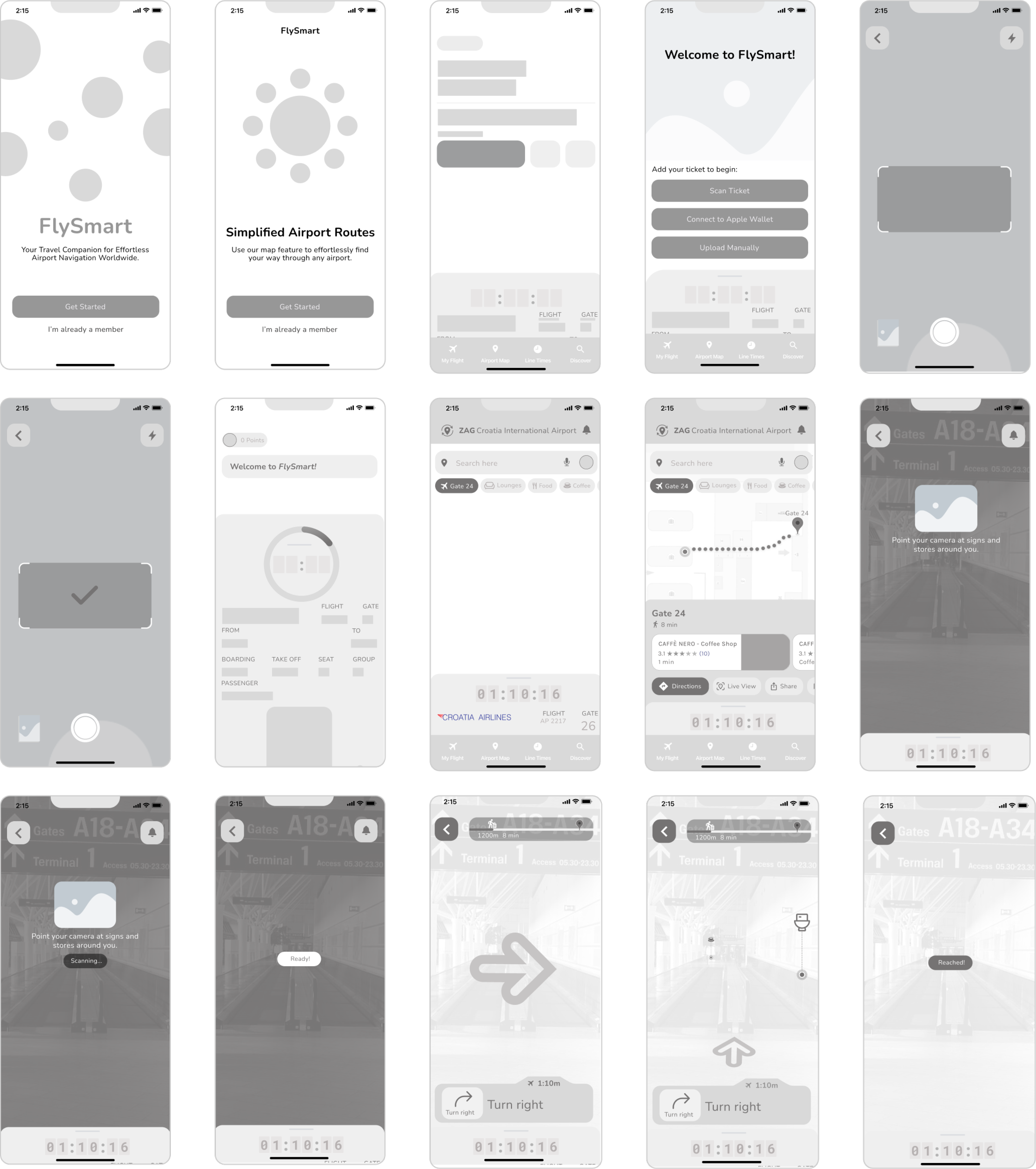
Step 5: Test
Candidates who are frequent flyers: 3 have experience using technology solutions in an airport and 2 do not.
Using click-through prototype to conduct 3 tasks, focusing on the mapping feature.
Step 6: Iterate
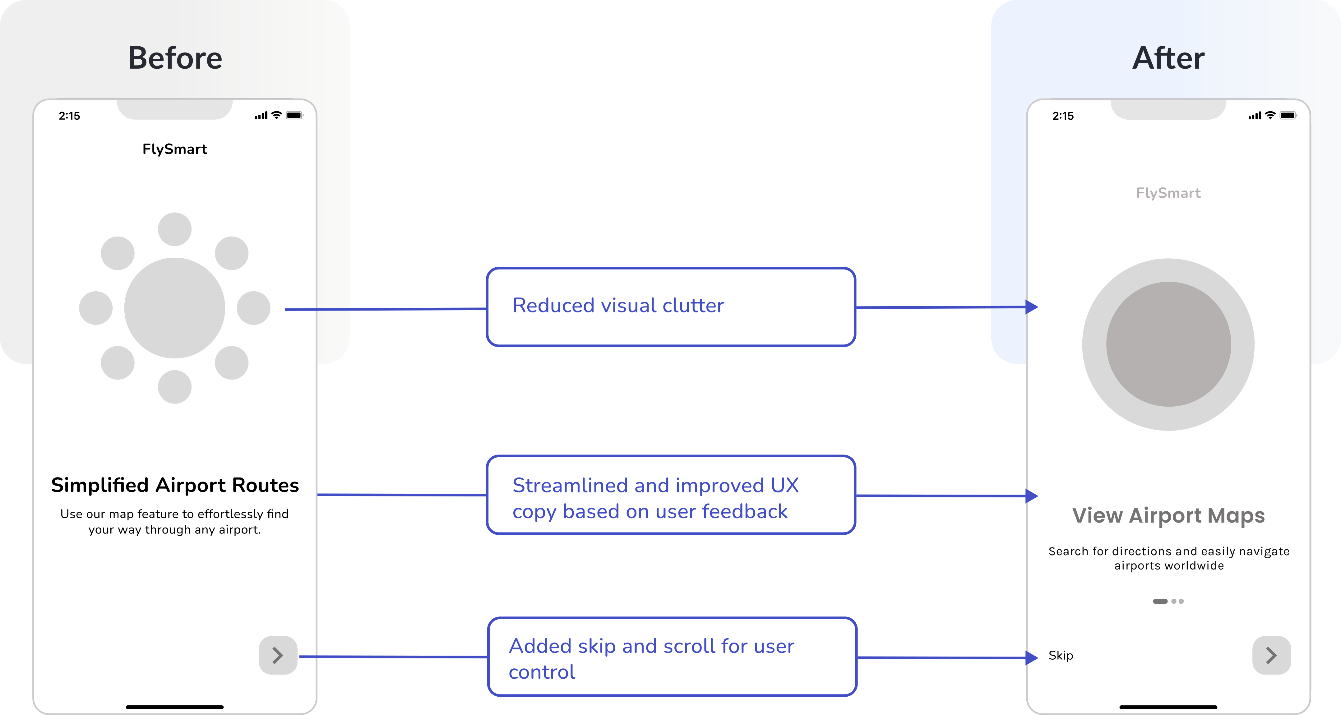
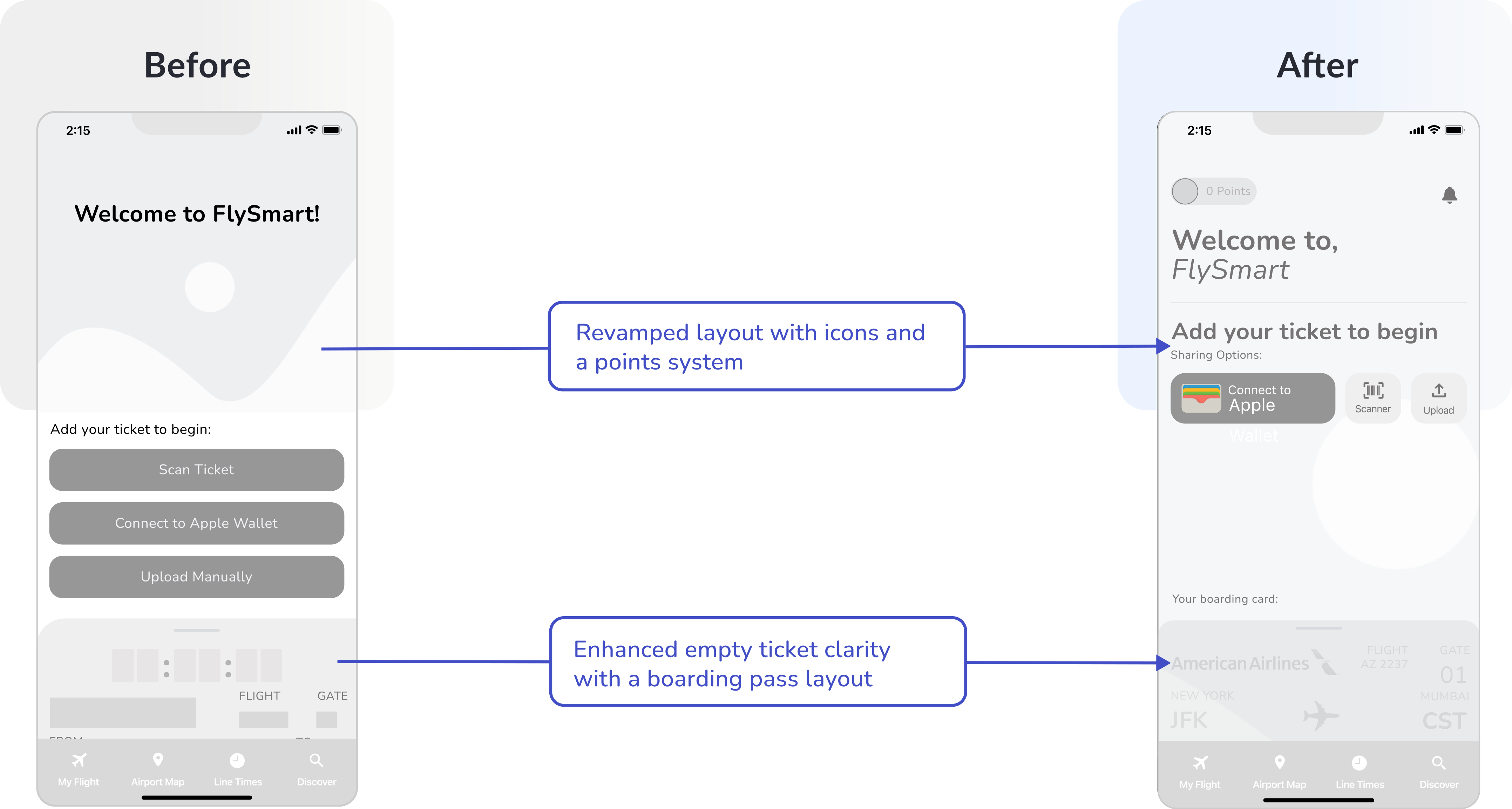

Step 7: Ideate | Step 8: Define
I meticulously developed FlySmart's visual identity. Here's a brief glimpse of my design decisions. For a detailed look, click the button below.
Step 9: Iterate
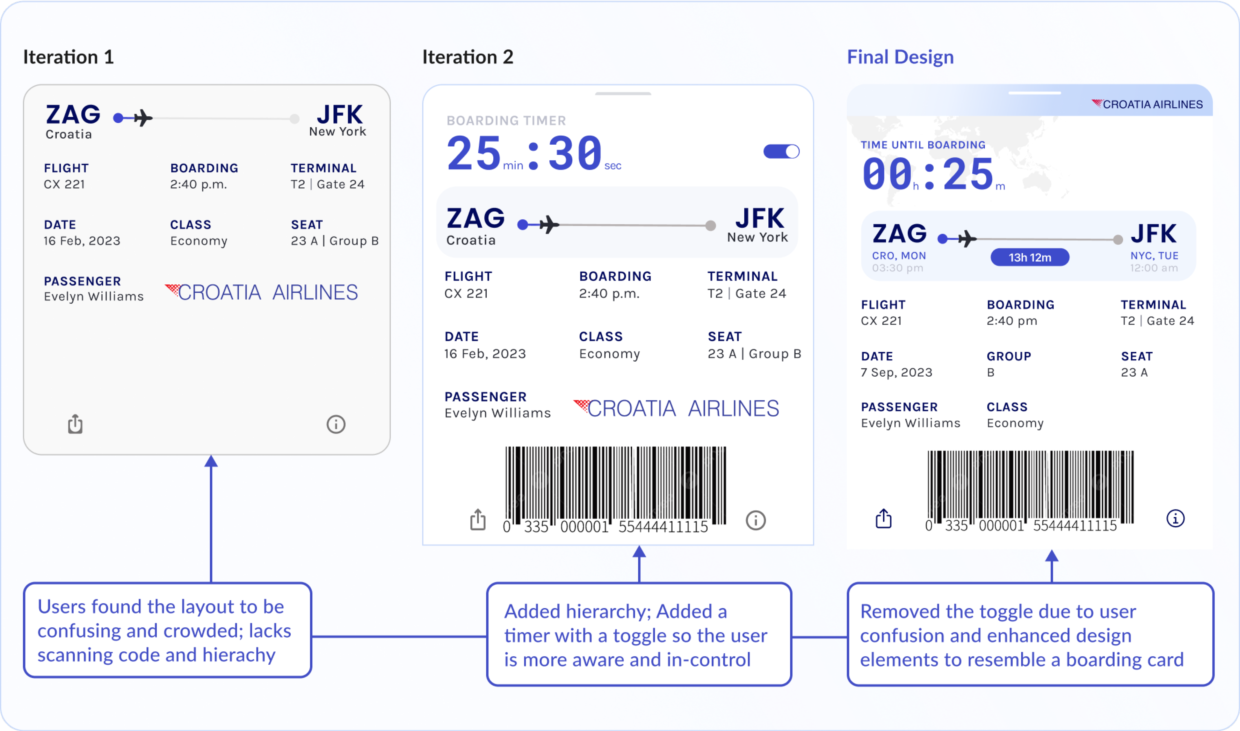
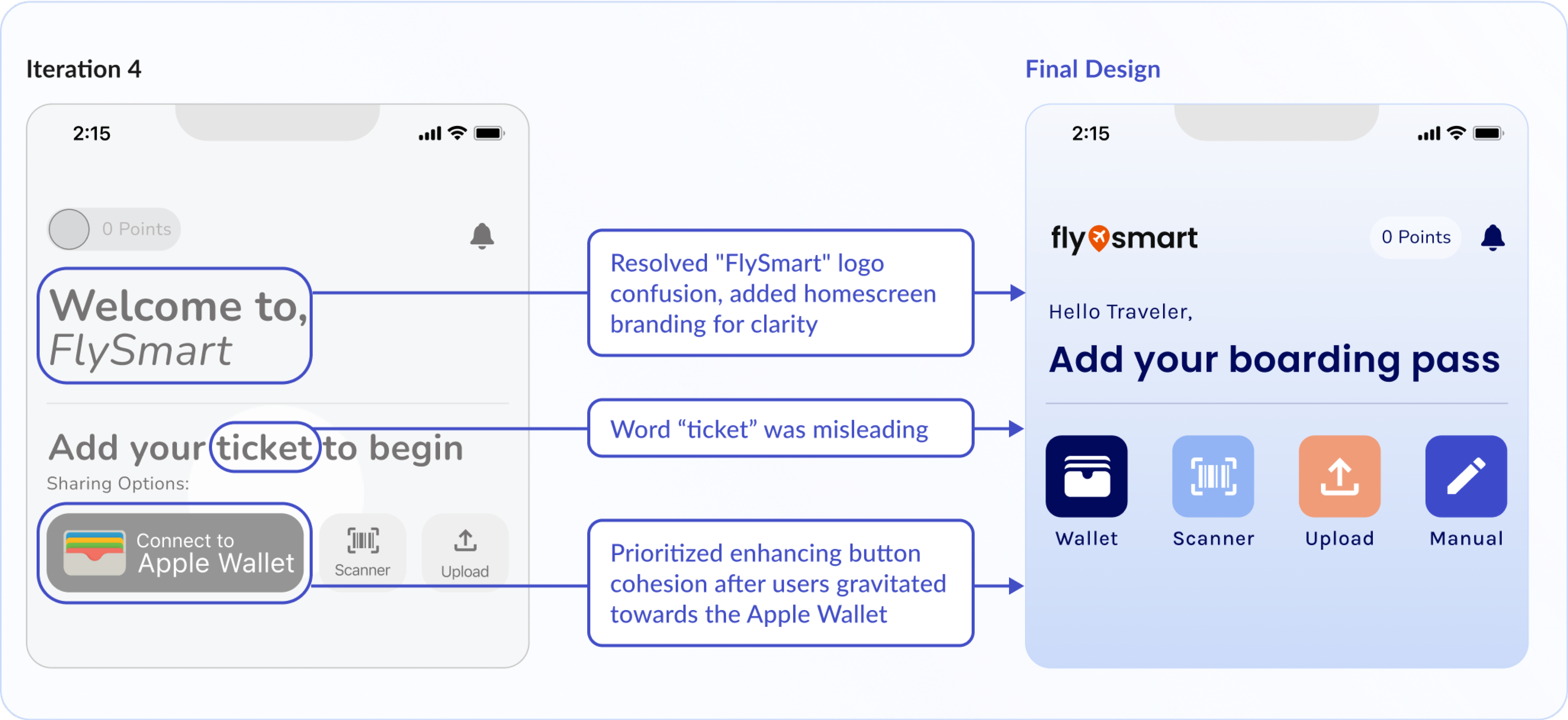
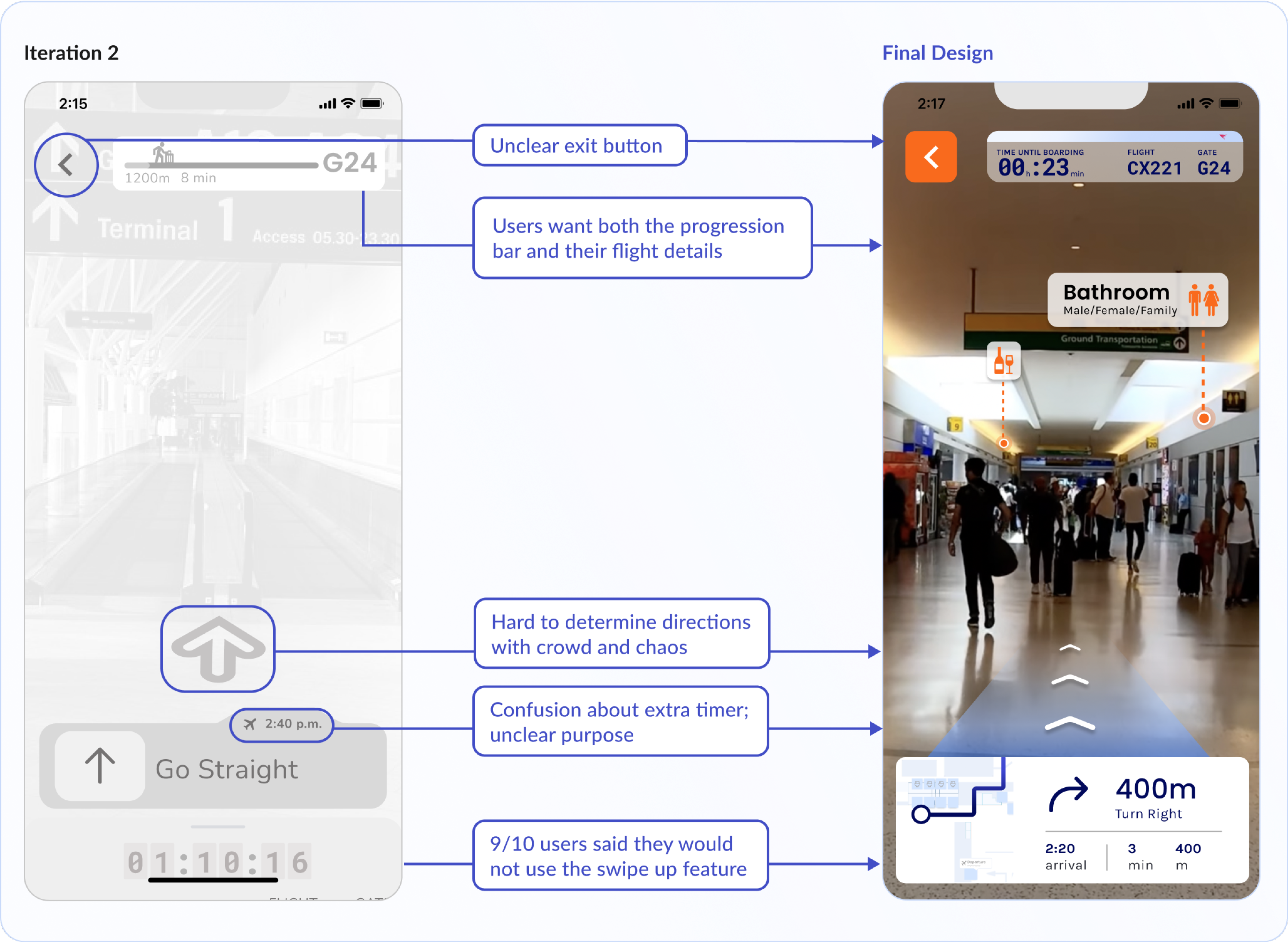
After transitioning to high-fi, I conducted 2 more rounds of usability tests. Fun fact, the empty boarding card state had over 7 iterations!
Boarding Pass | Empty State

Boarding Pass | Full State
Homescreen | New Trip
”Live View” Feature | AR/VR
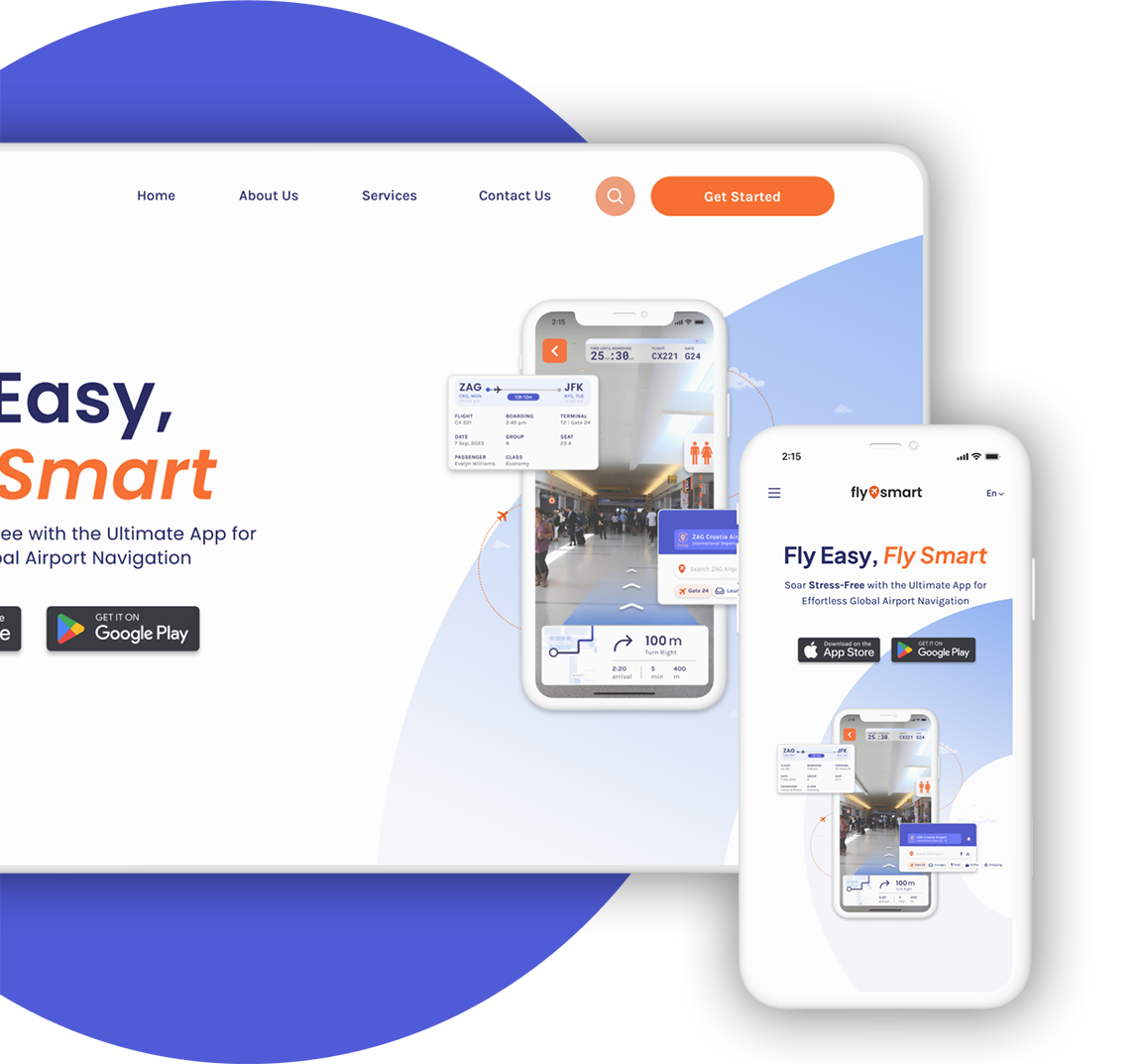
I developed a responsive marketing website to enhance visibility and drive conversions by showcasing the app's value proposition. This included engaging animations, interactions, and seamless branding integration to create a unified user experience.

Reflection
I chose focus solely on improving the mapping tool to concentrate all resources/effort on delivering an exceptional user experience in this key area.
User needs vary, making a universal solution impractical. Focusing on the majority while considering diversity is a more efficient UX approach.
Your presentation matters as much as your work. I've maintained a strong visual brand, emphasizing the importance of small details in demonstrating the product's effectiveness.
Next Steps
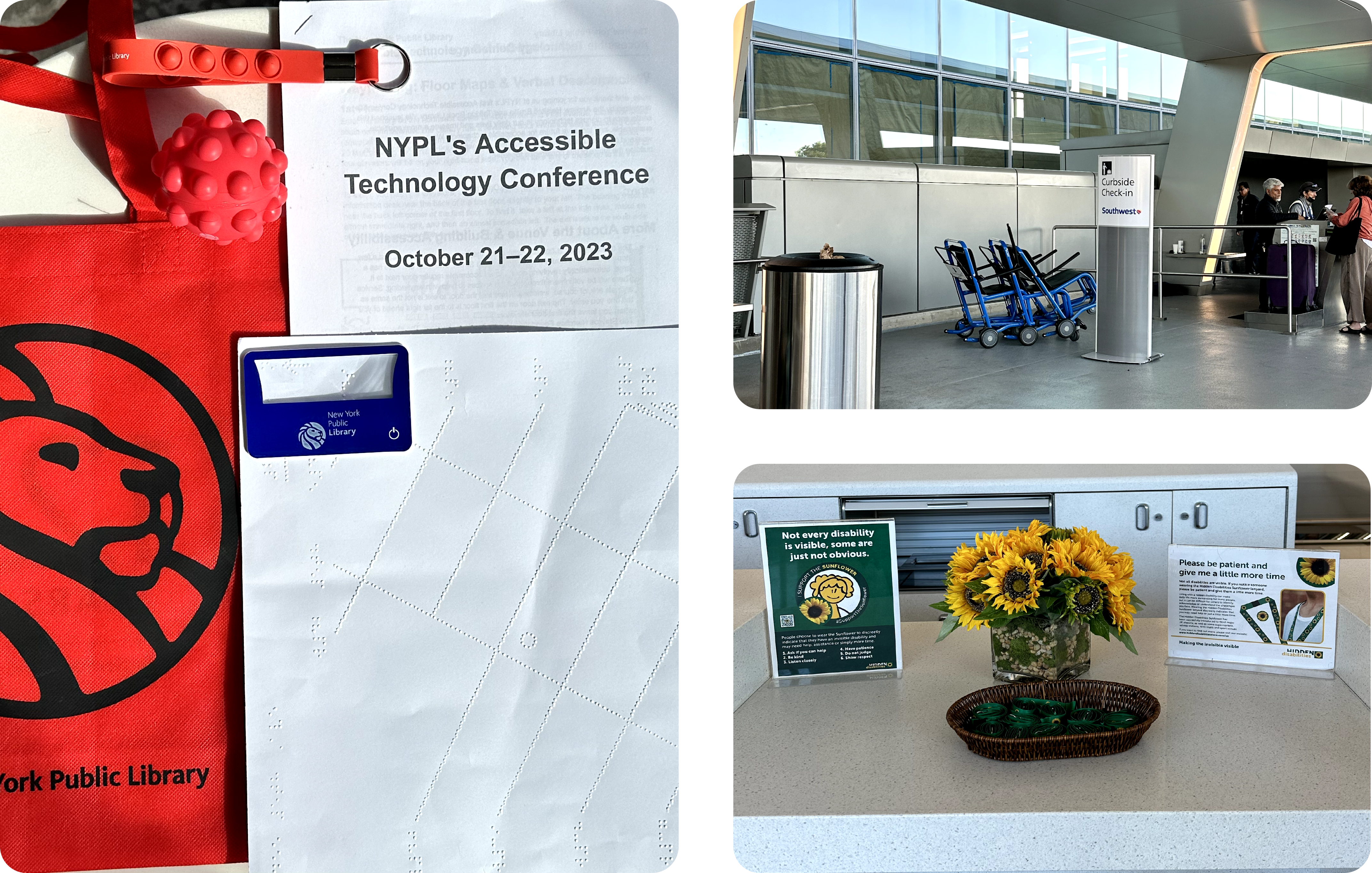
For my senior capstone at Parsons, I have returned to the research stage, focusing on akin issues, but through the perspective of travelers with disabilities. Until December, I'm researching by talking to the community, experts, and attending events. In January, I'll start strategizing a human-centered solution based on my findings. I'm currently interviewing wheelchair users and visually impaired individuals. Here’s a peek at my observation studies!
